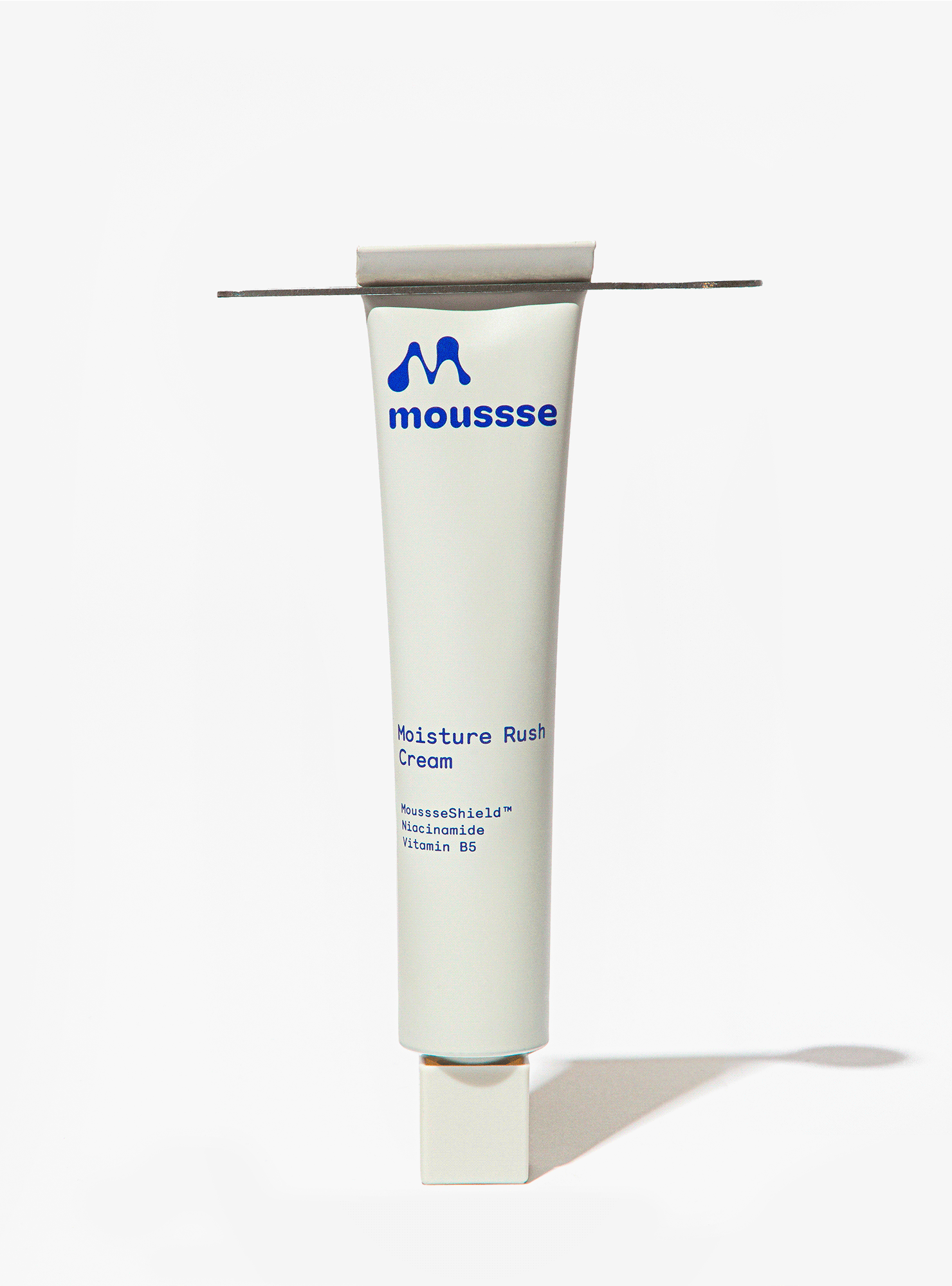
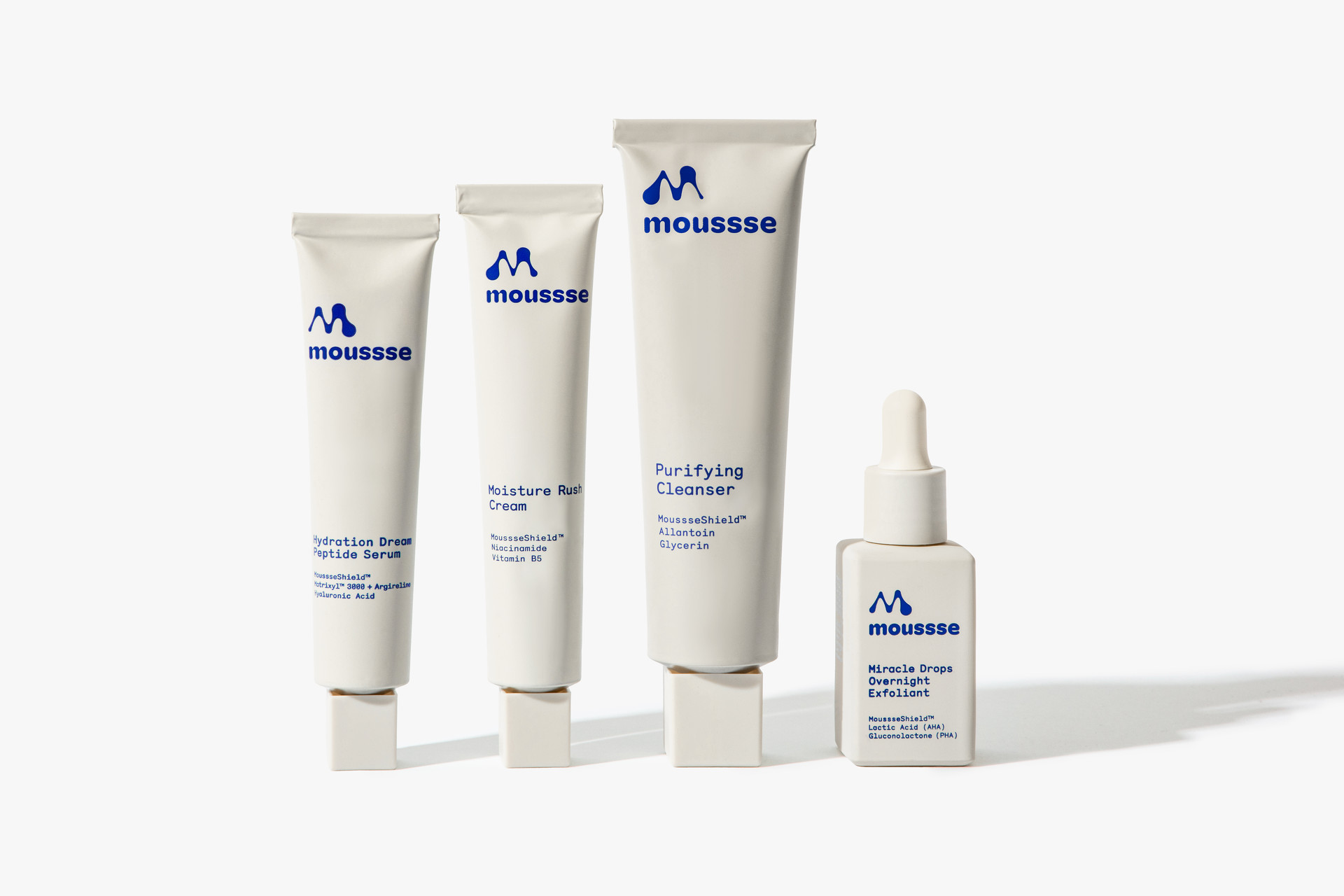
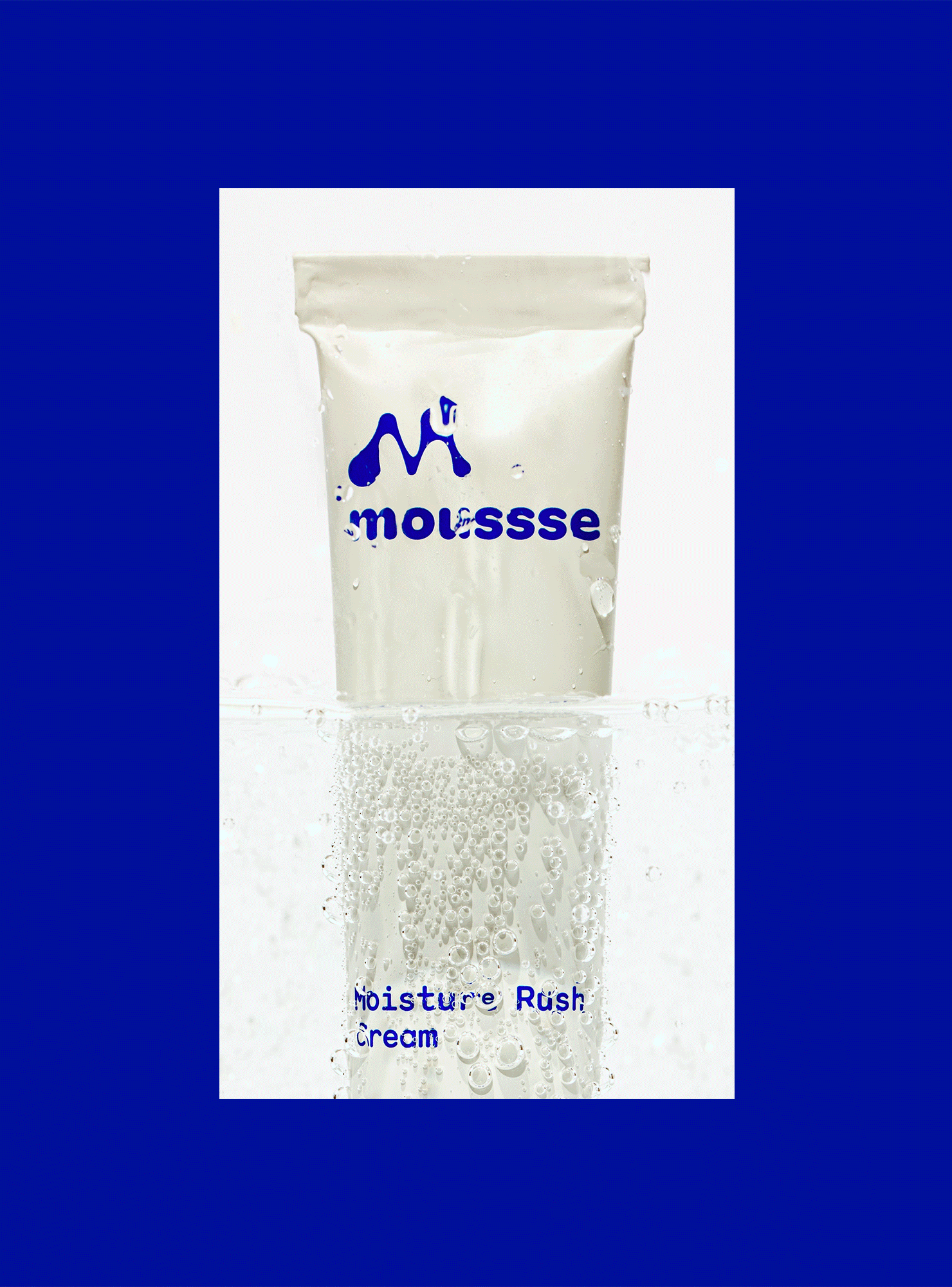
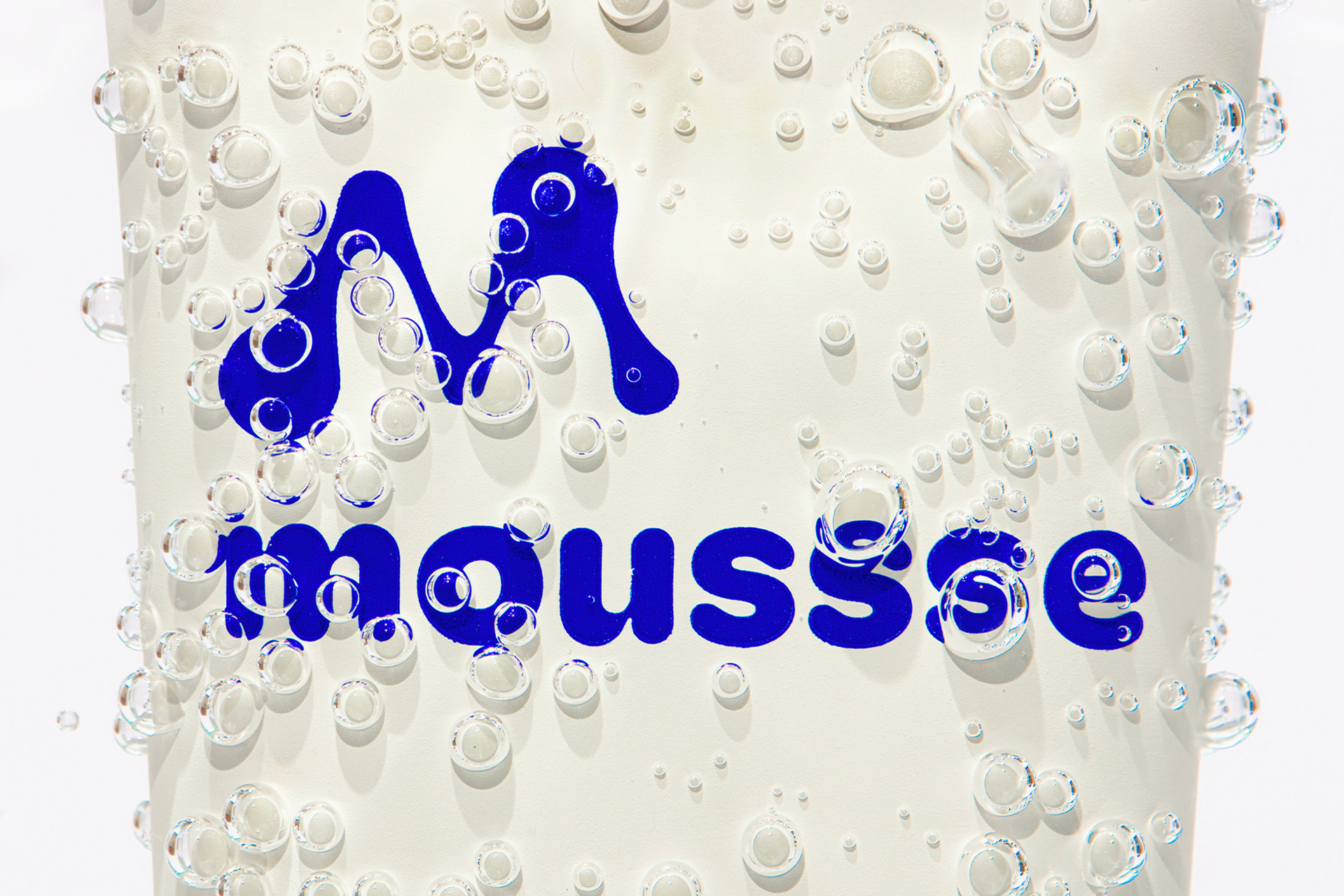
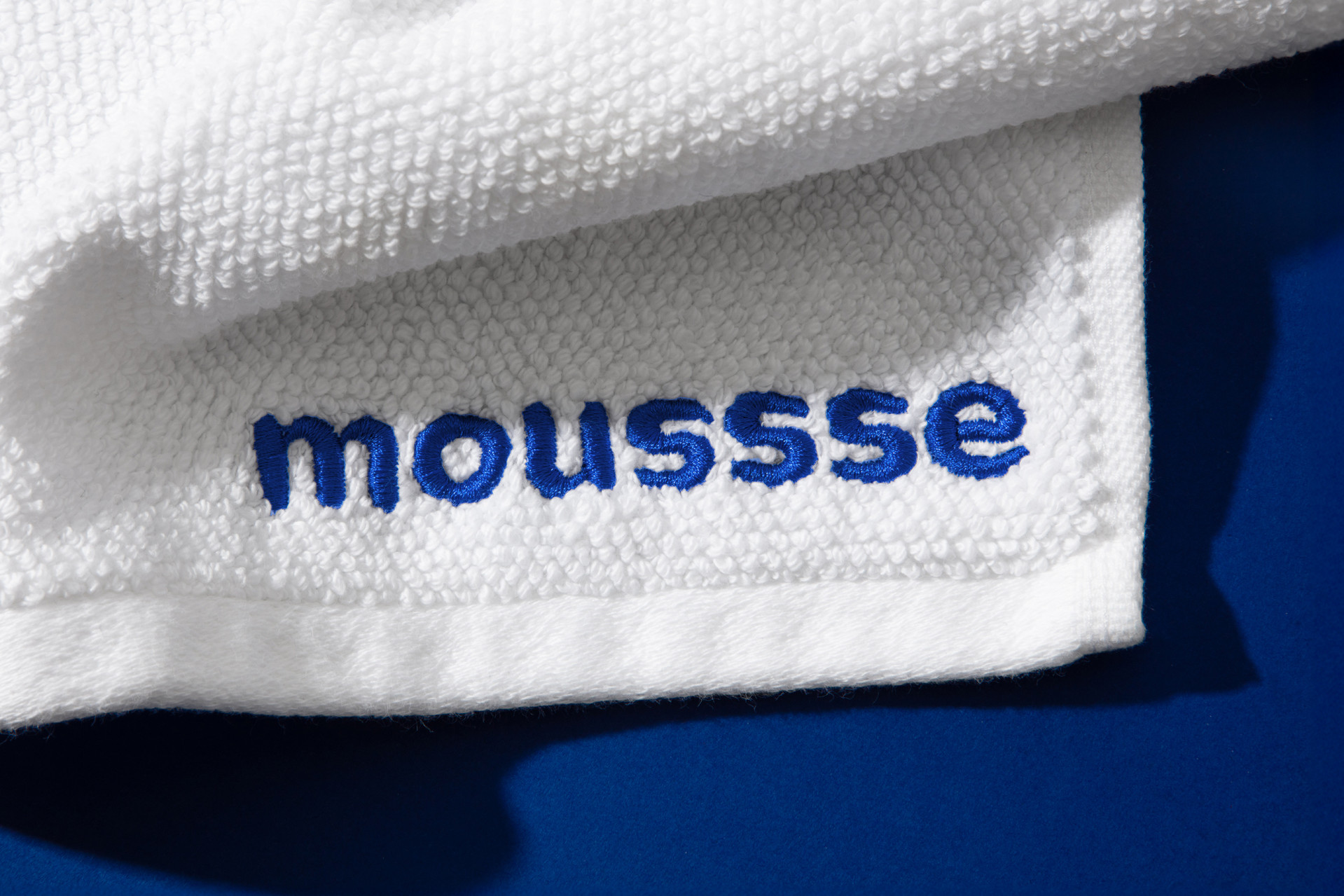
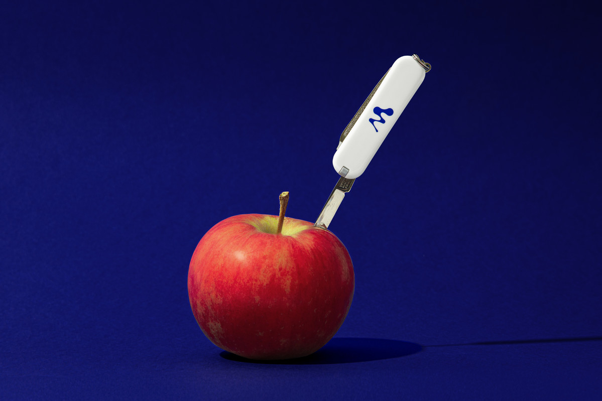
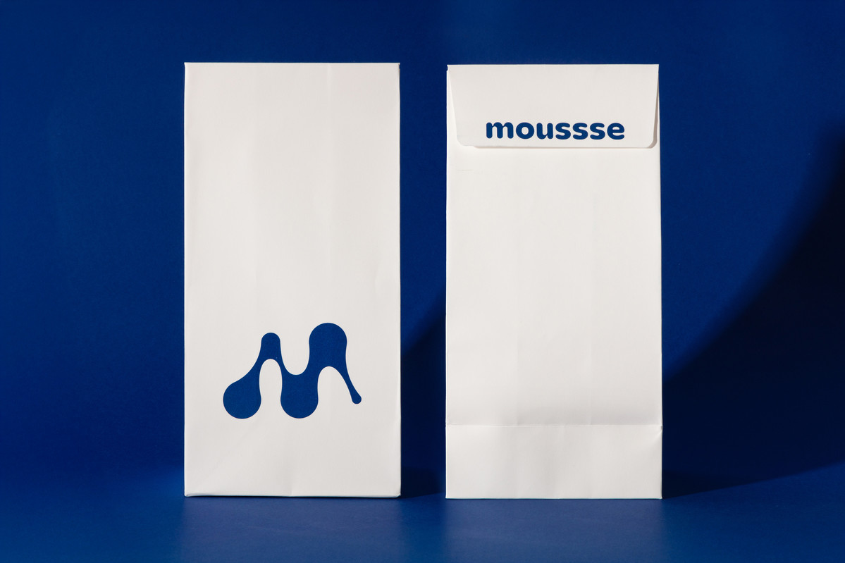
For the launch of this new Swiss beauty brand we collaborated closely with the founders to develop a unique and evocative name. A long succession of ‘s’s became the signature sound of a biotech skincare pioneer. Pronunciation: Mousssssssse.
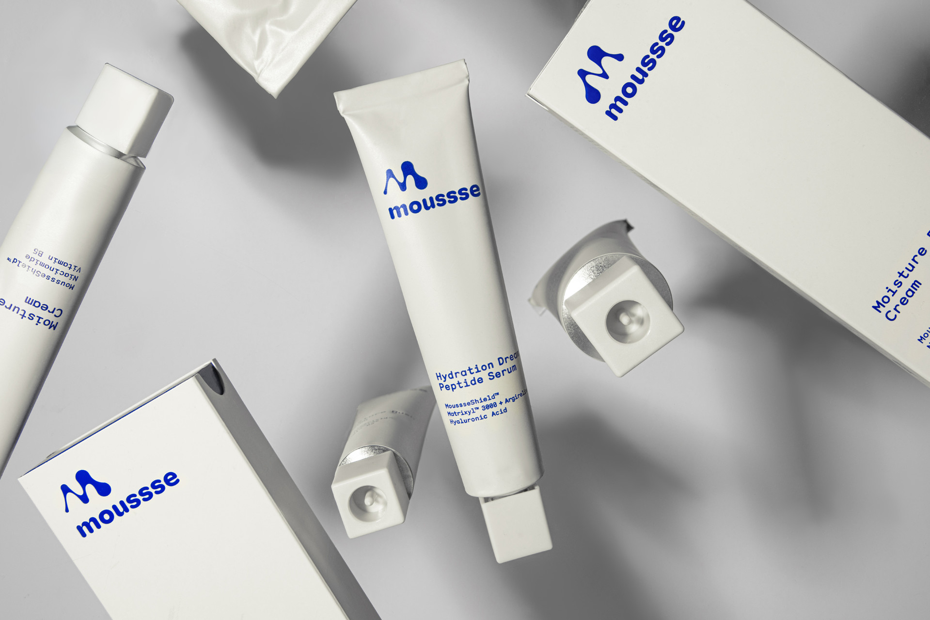
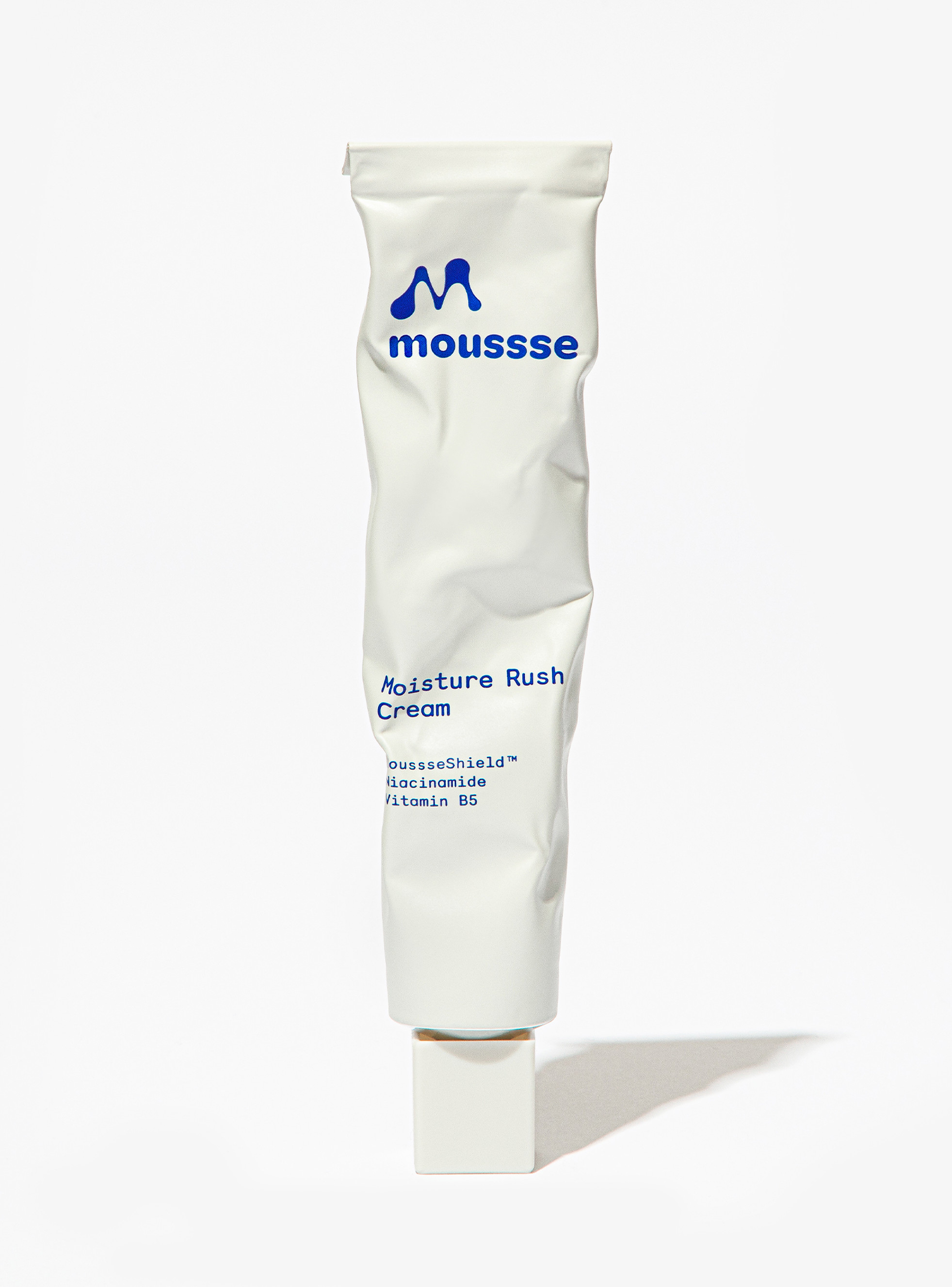
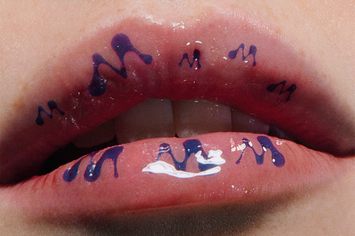
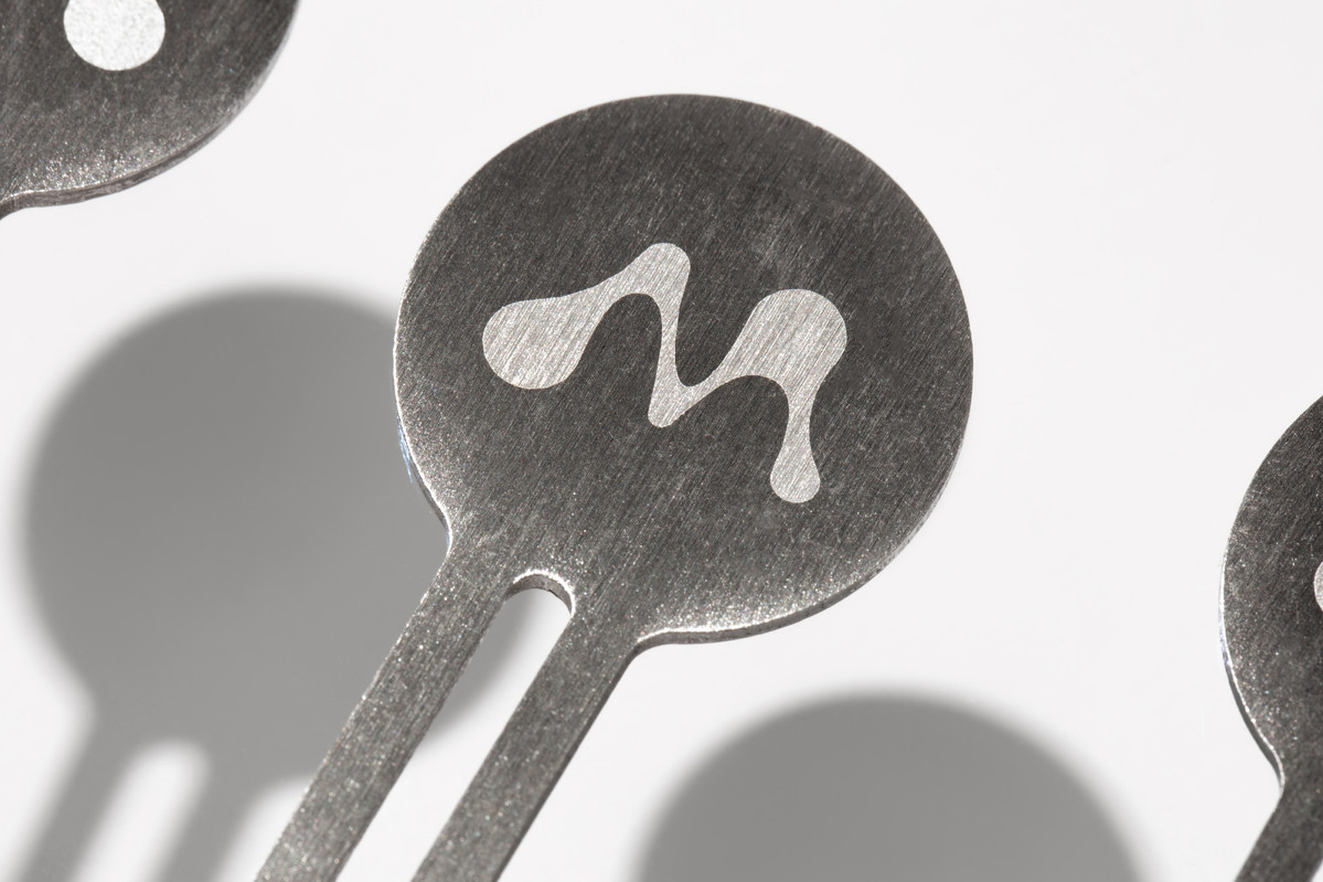
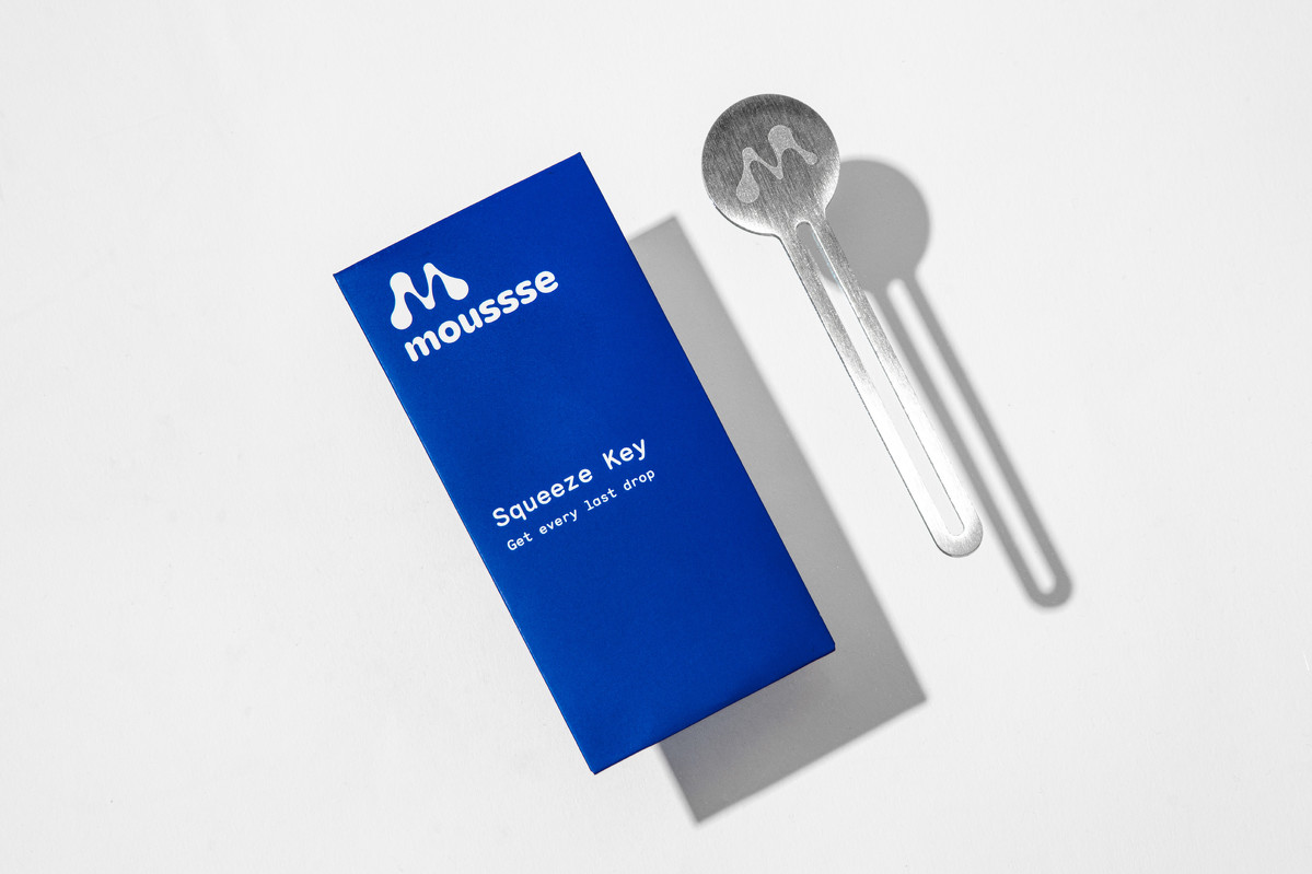
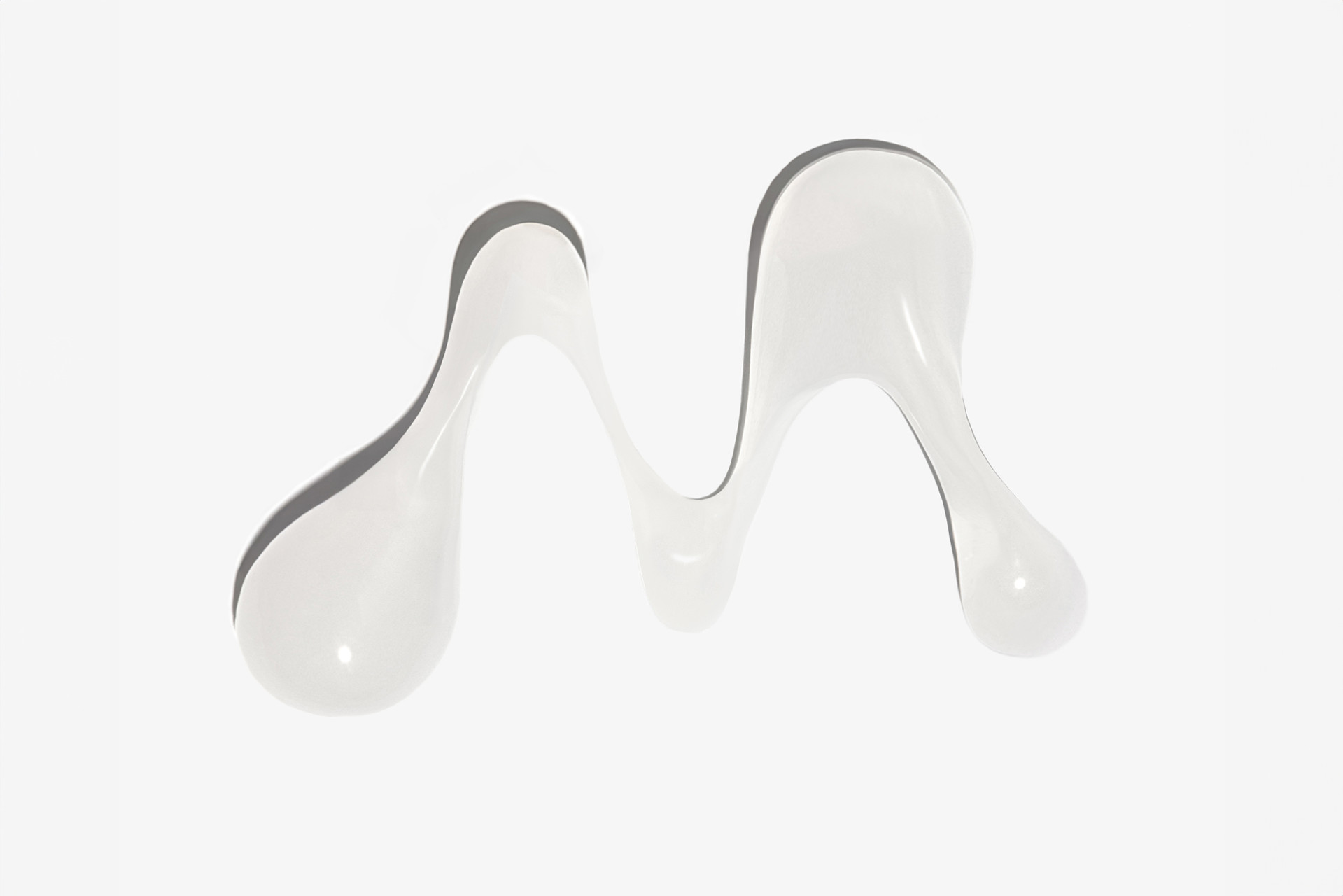
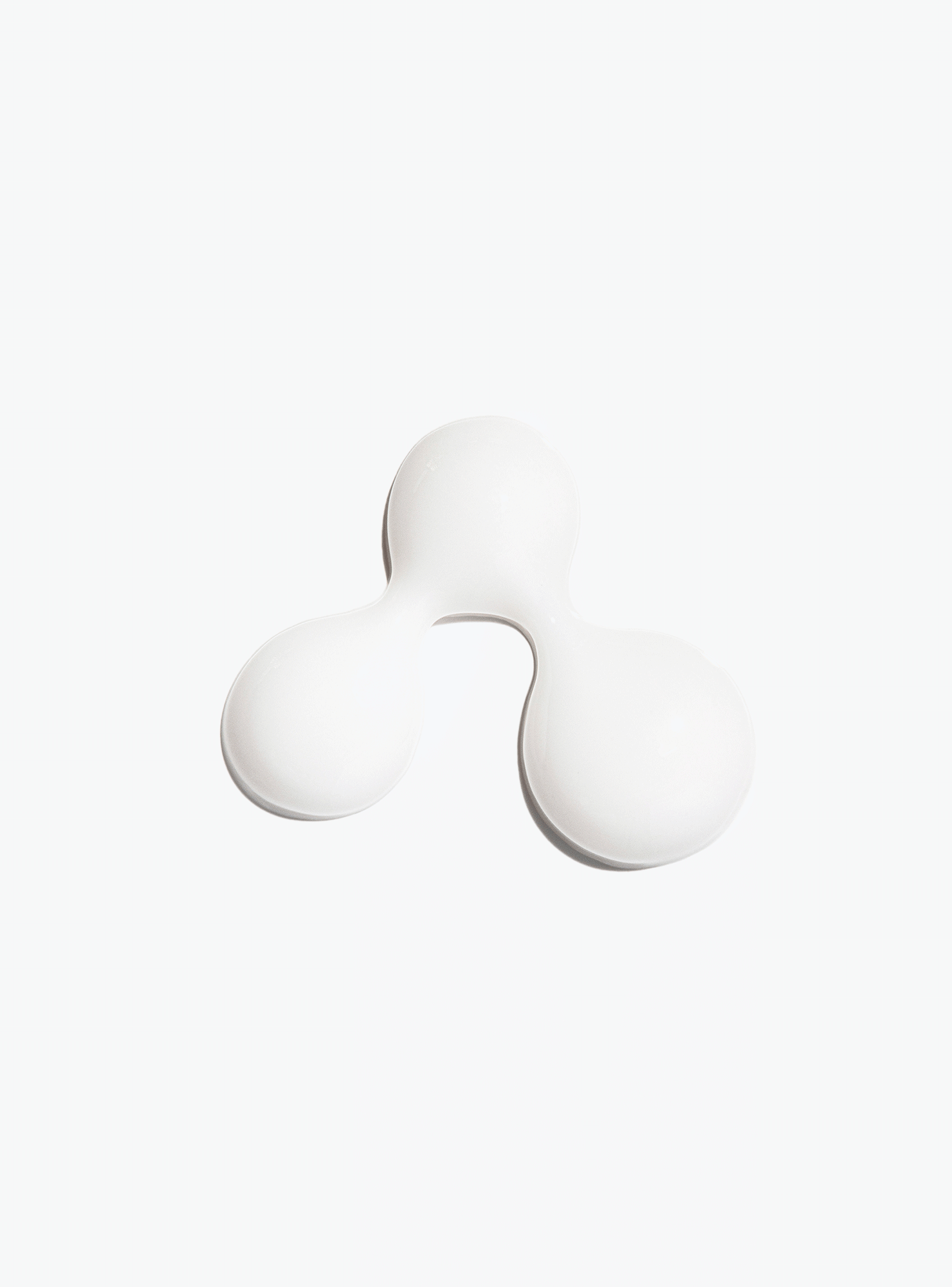
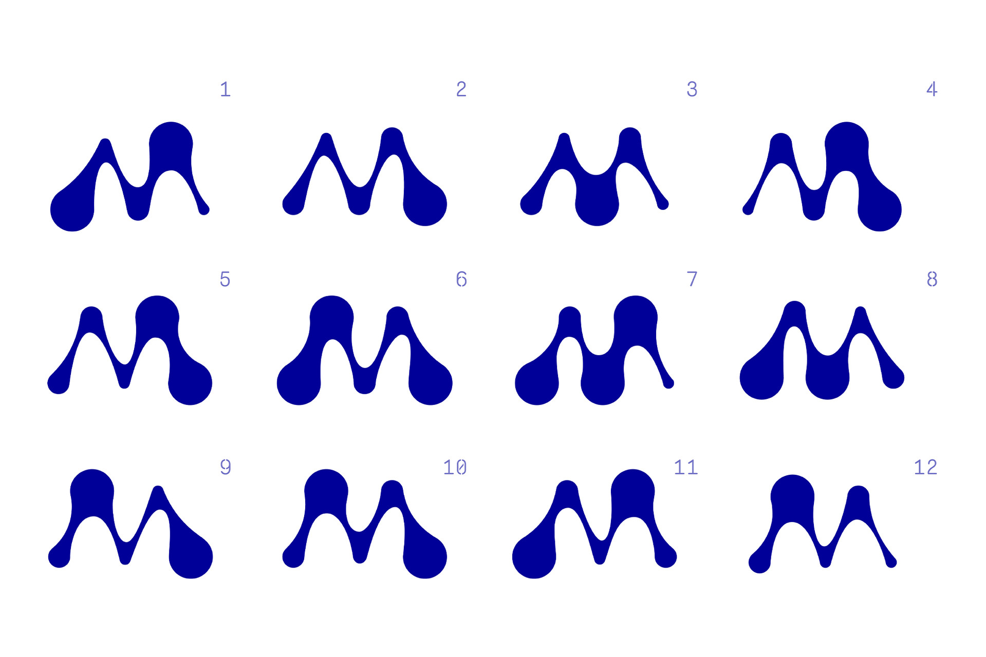
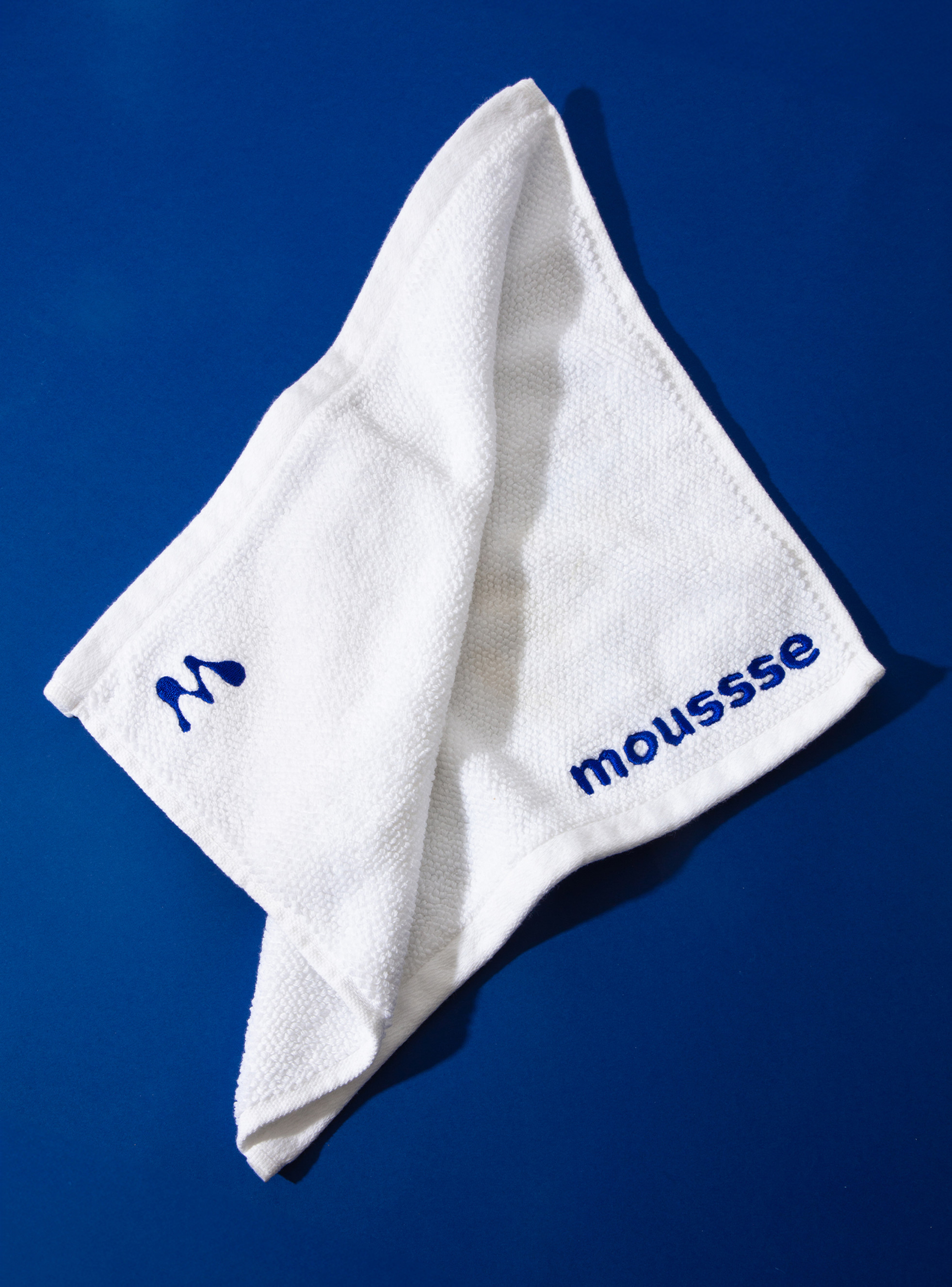
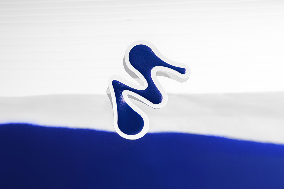
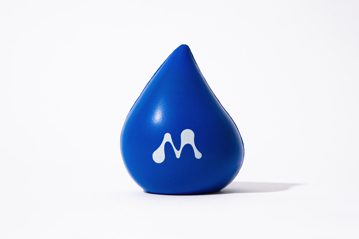
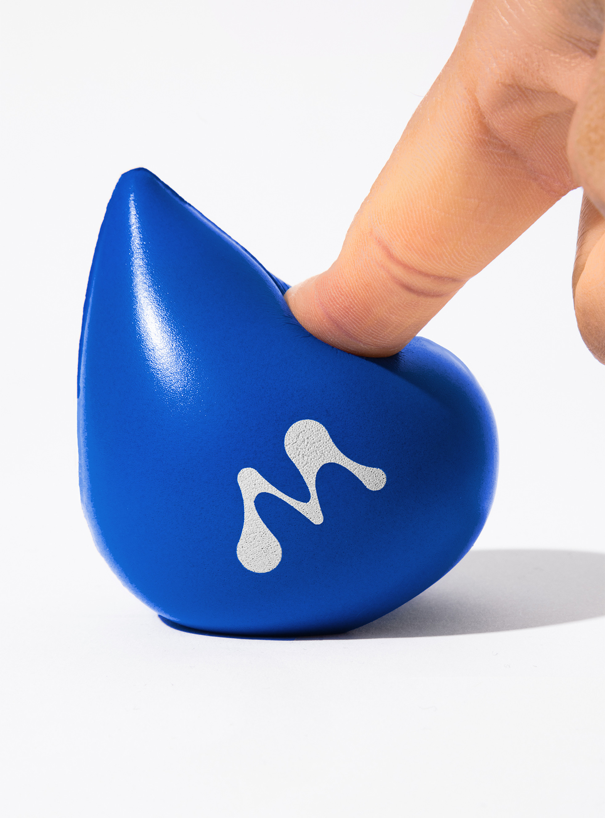
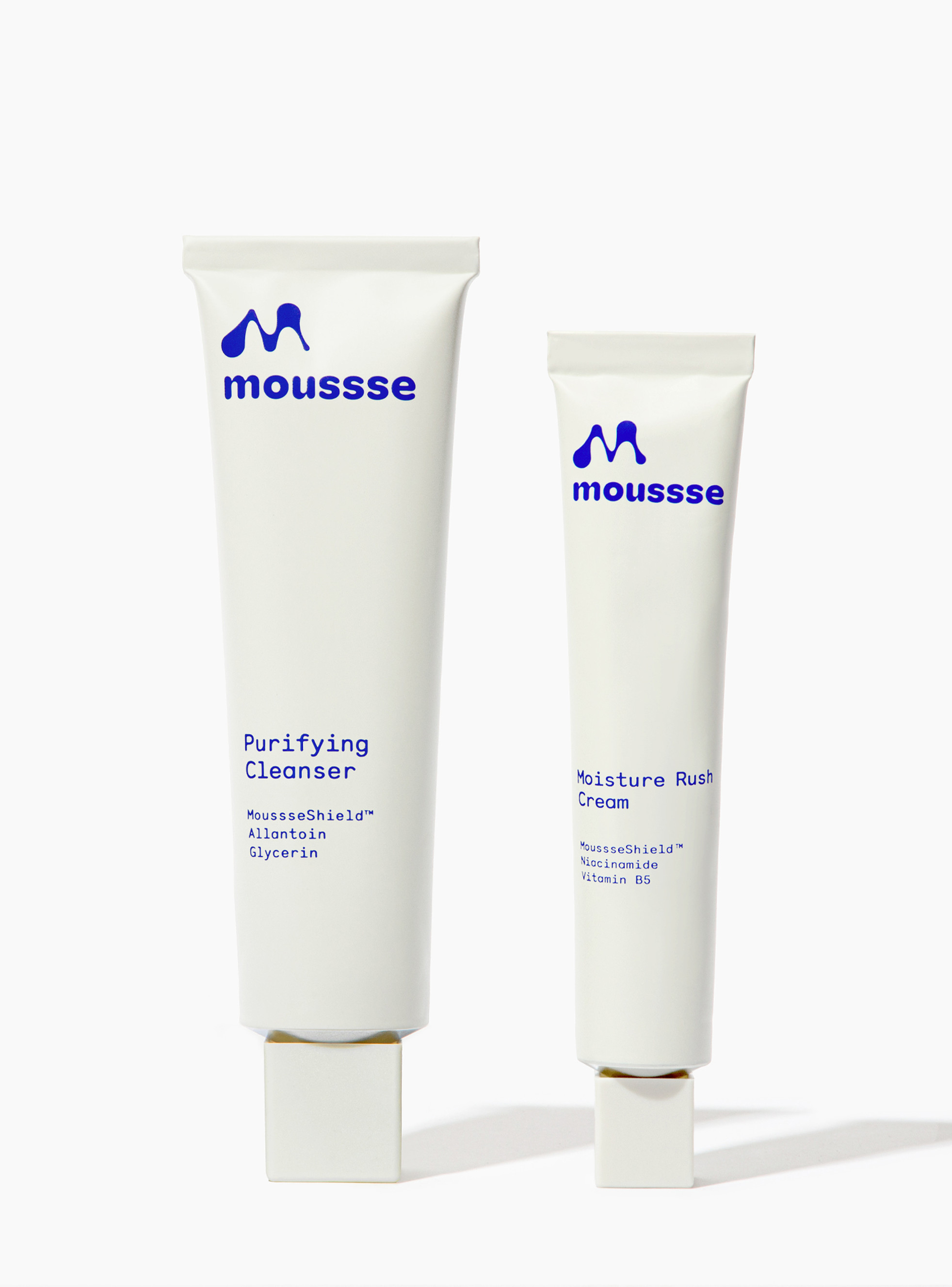
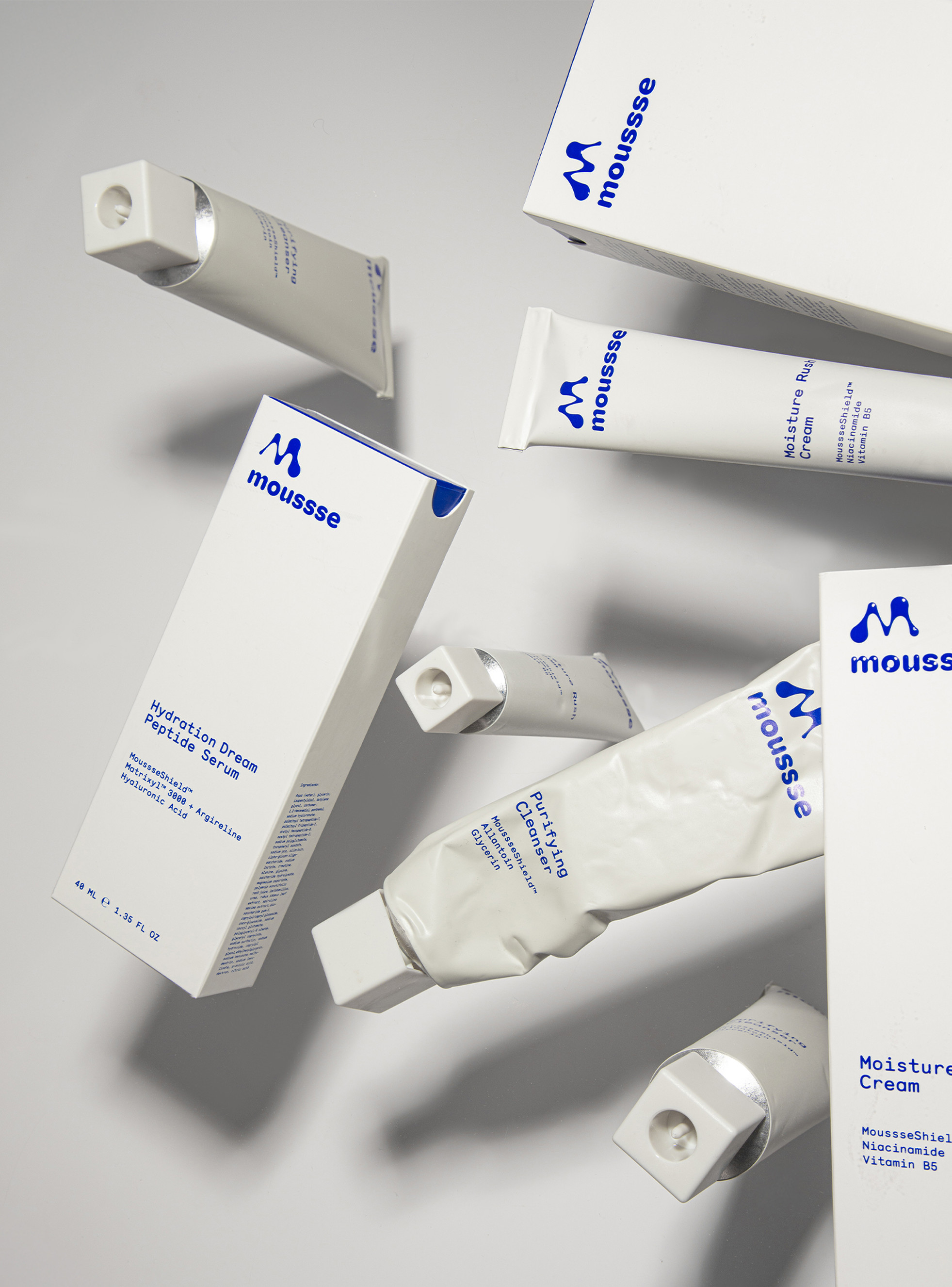
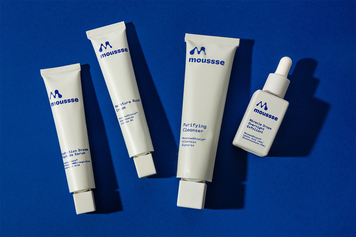
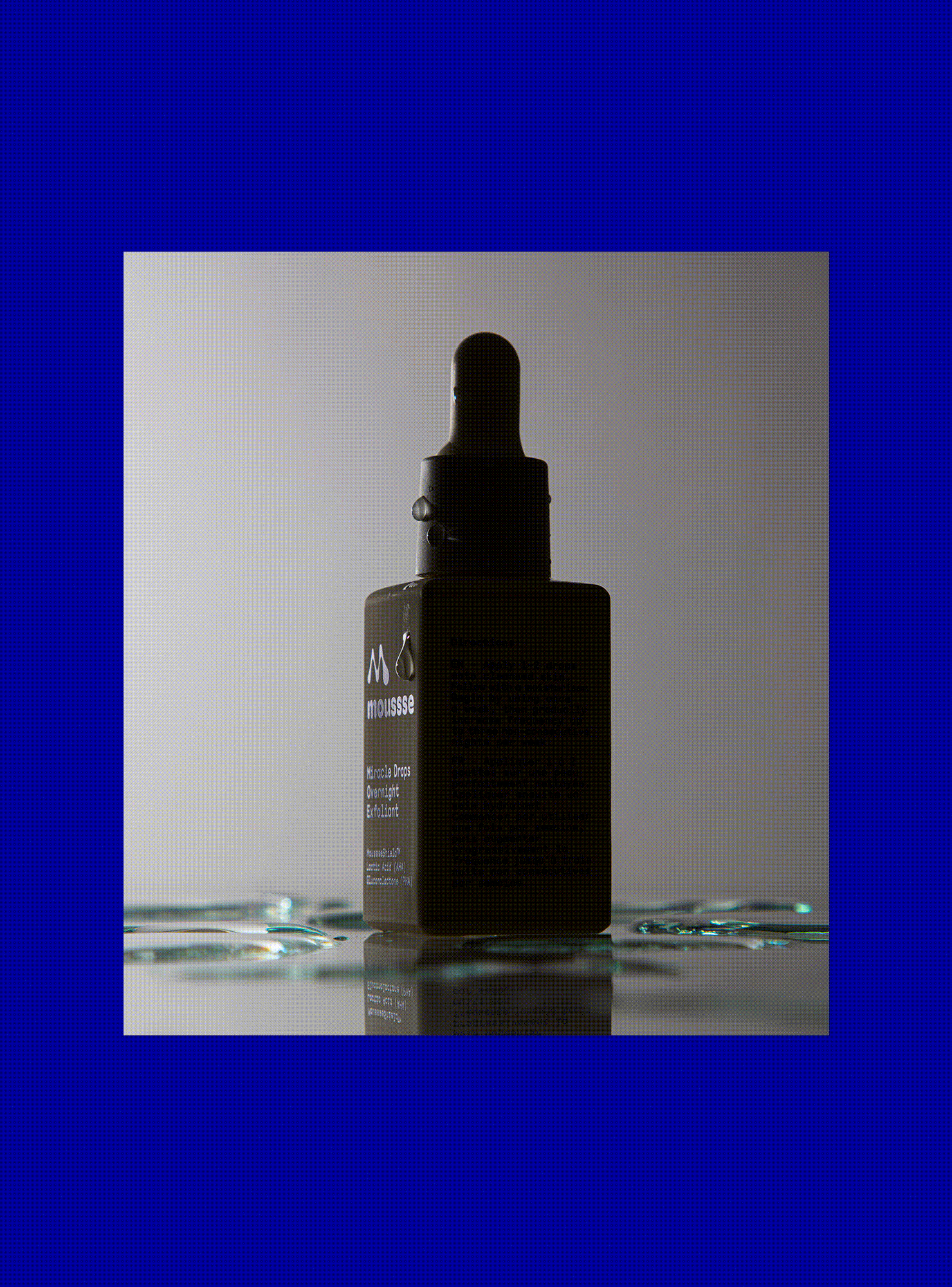
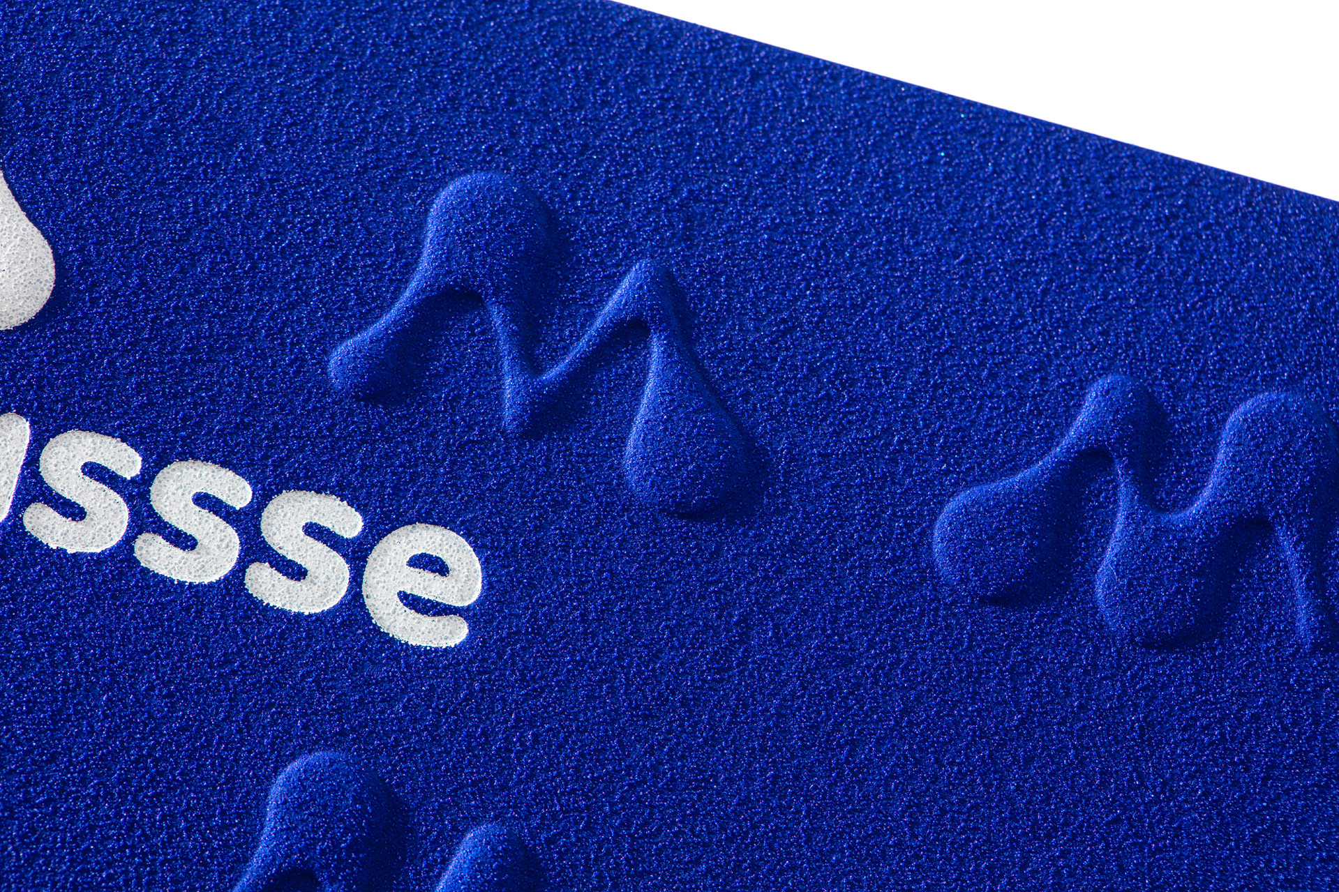
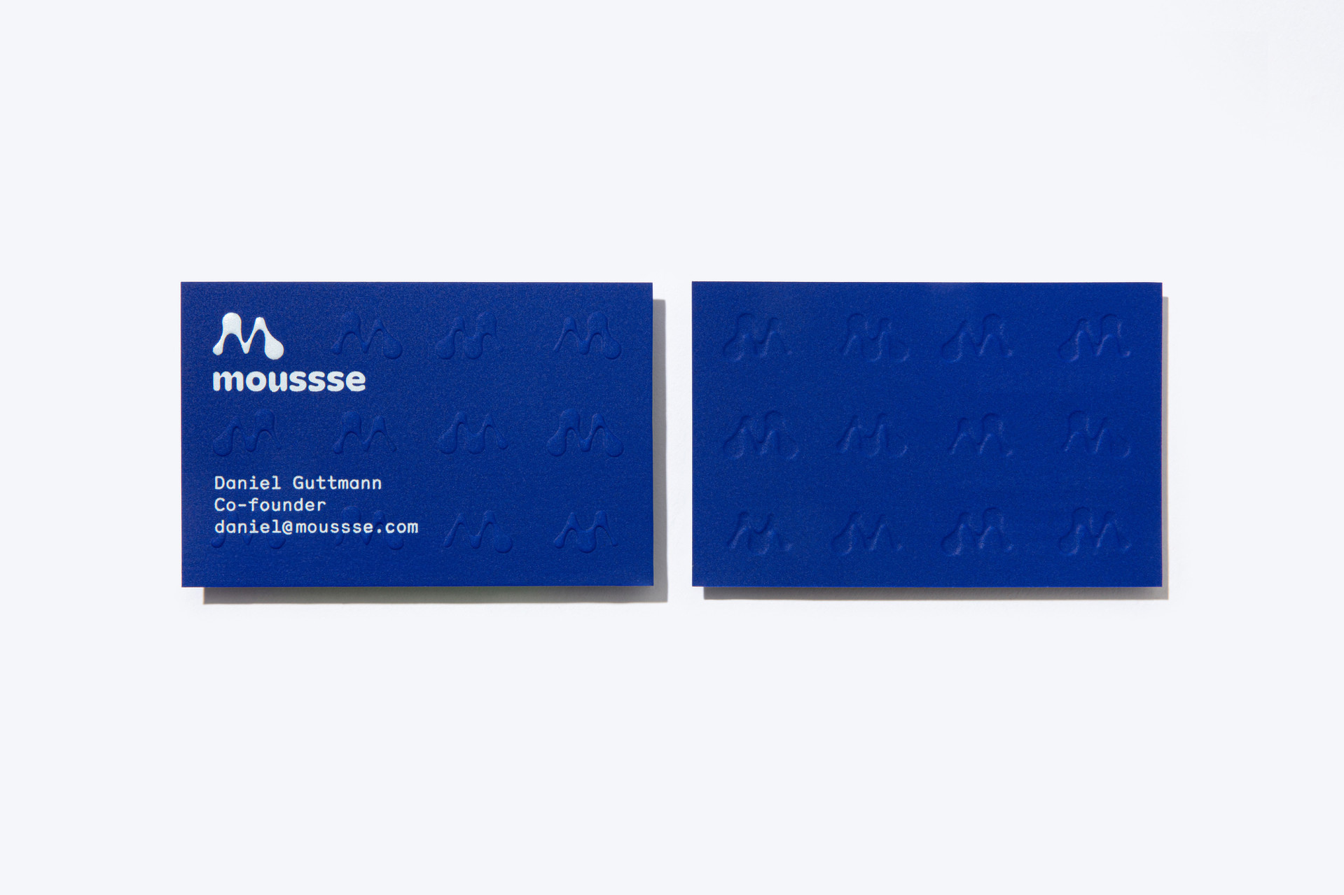
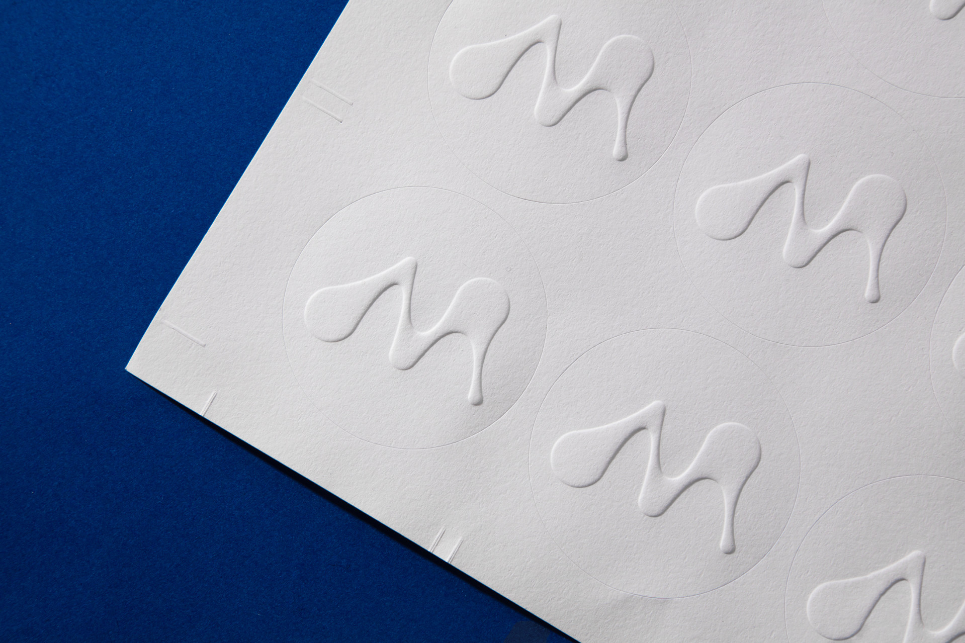
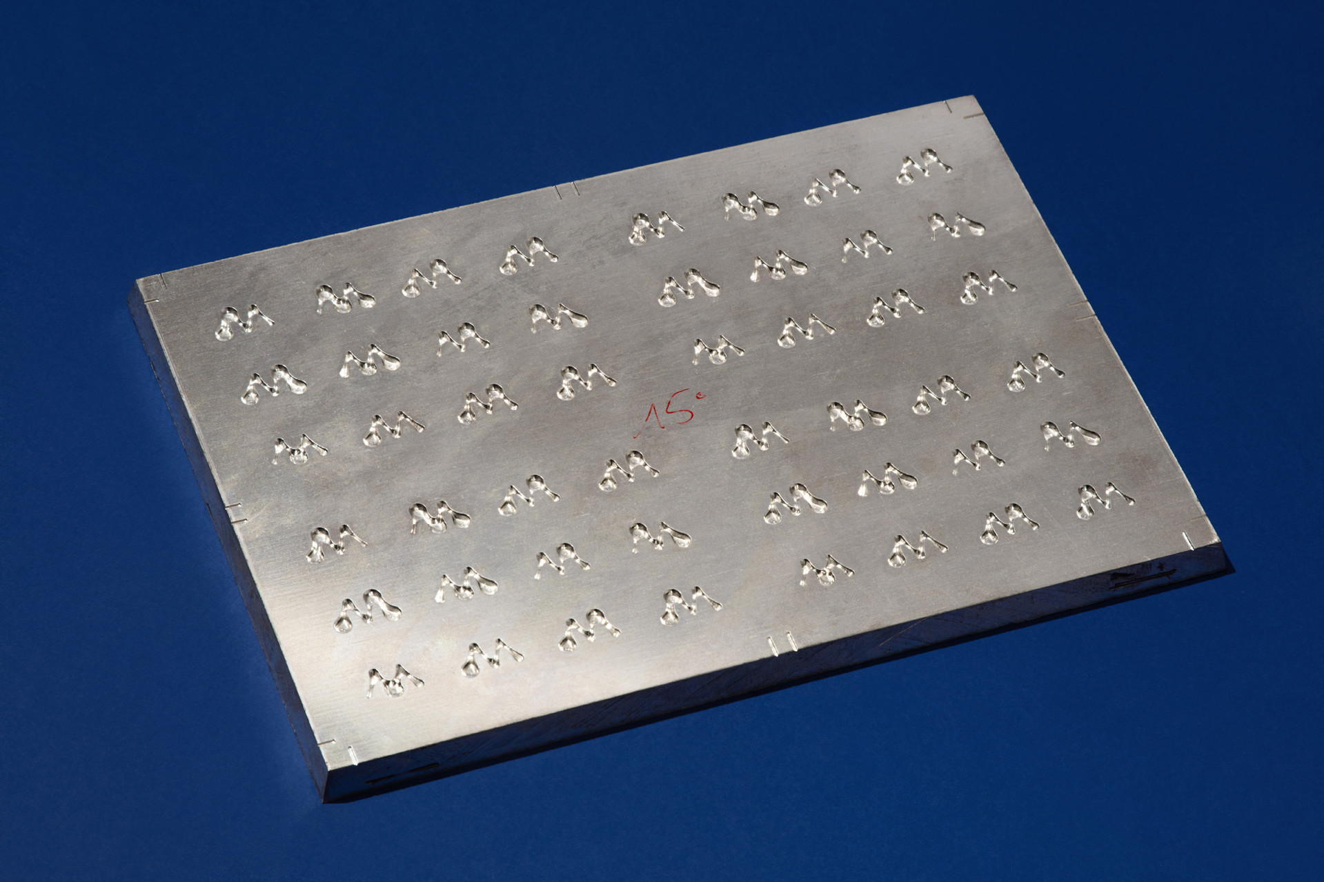
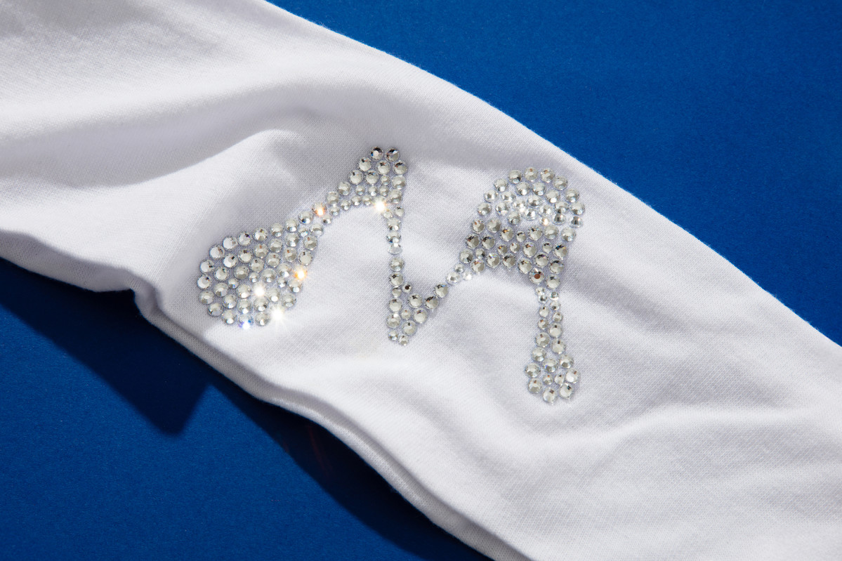
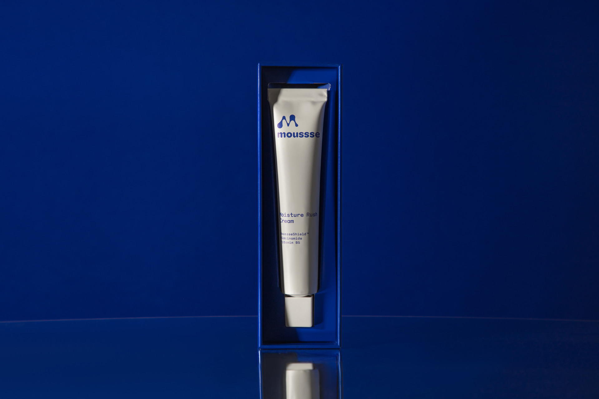
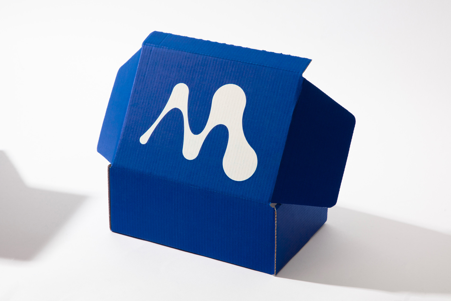
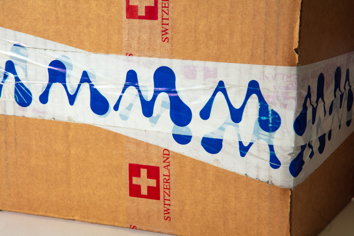
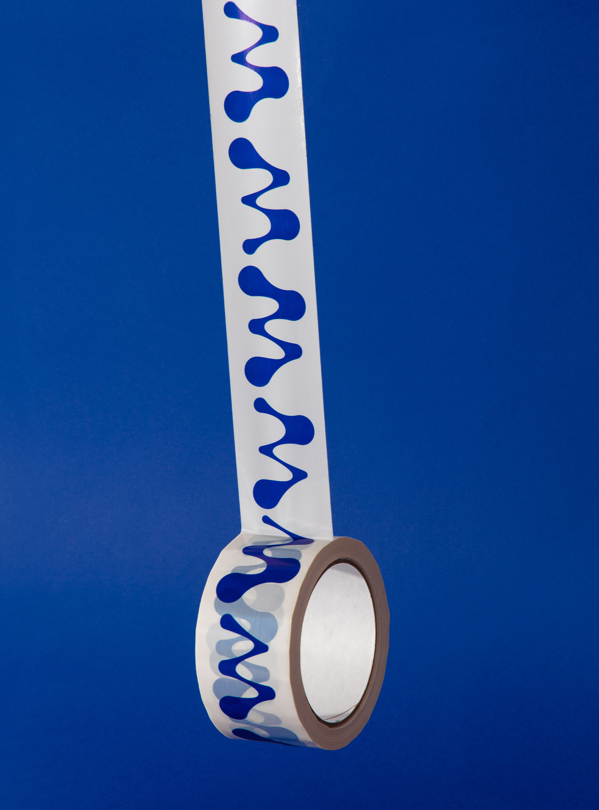
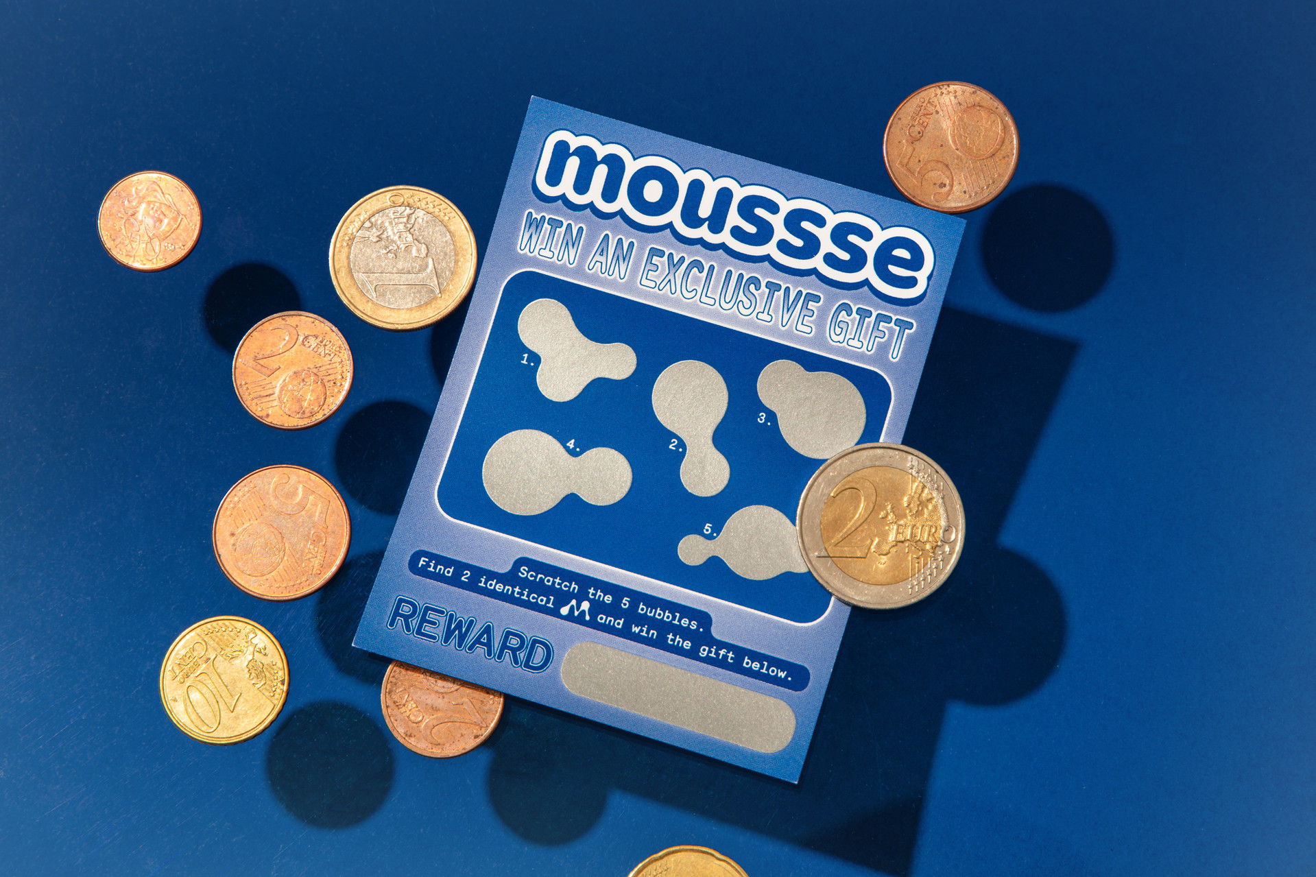
Our flexible icon system utilises twelve versions of an uppercase ‘M’ including all the variants in between for the symbol’s digital animations. The brand identity pairs a palette of electric blue and off-white, anchored by Monosten, a monospace typeface from Colophon, to establish scientific precision.
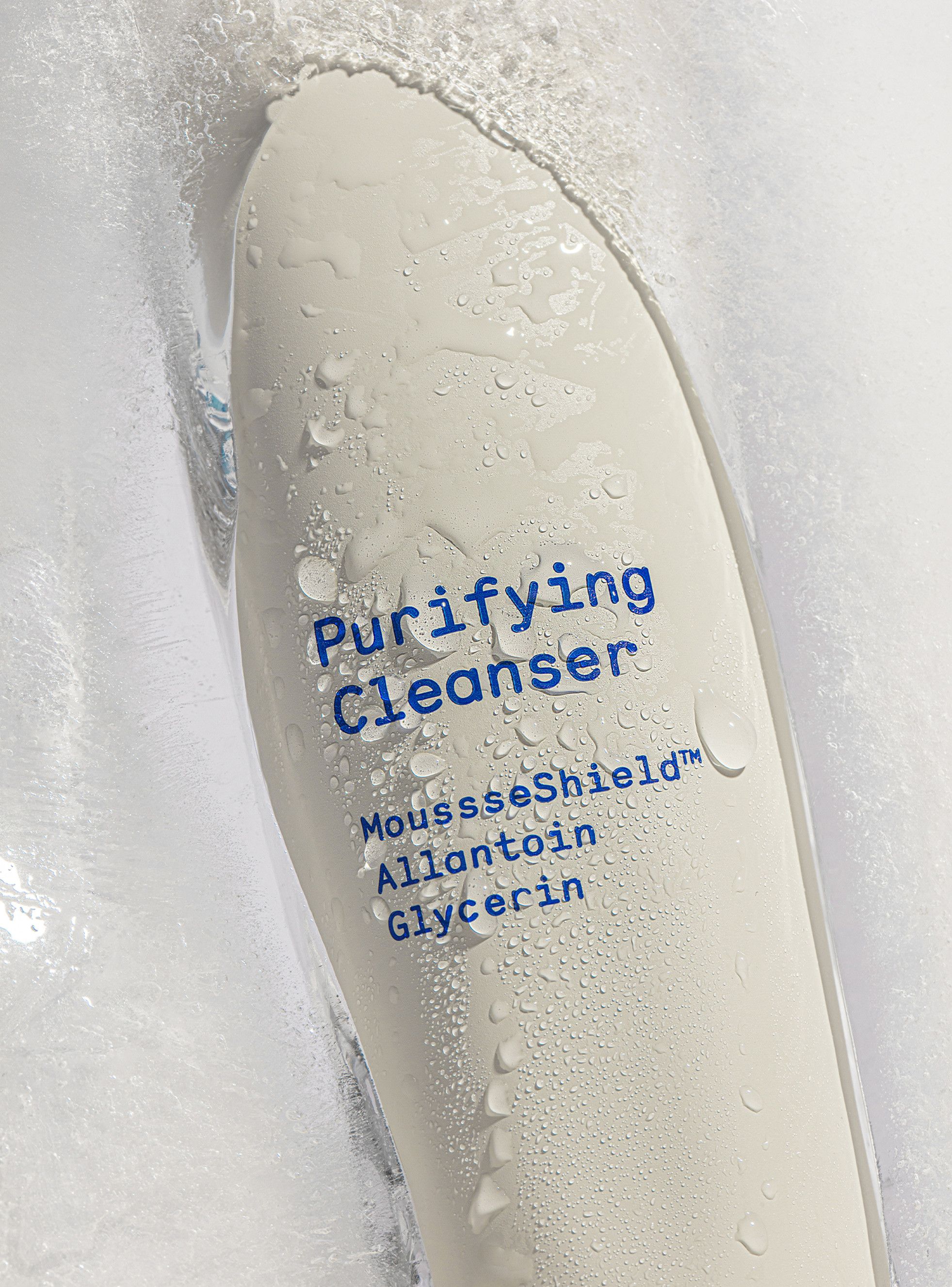
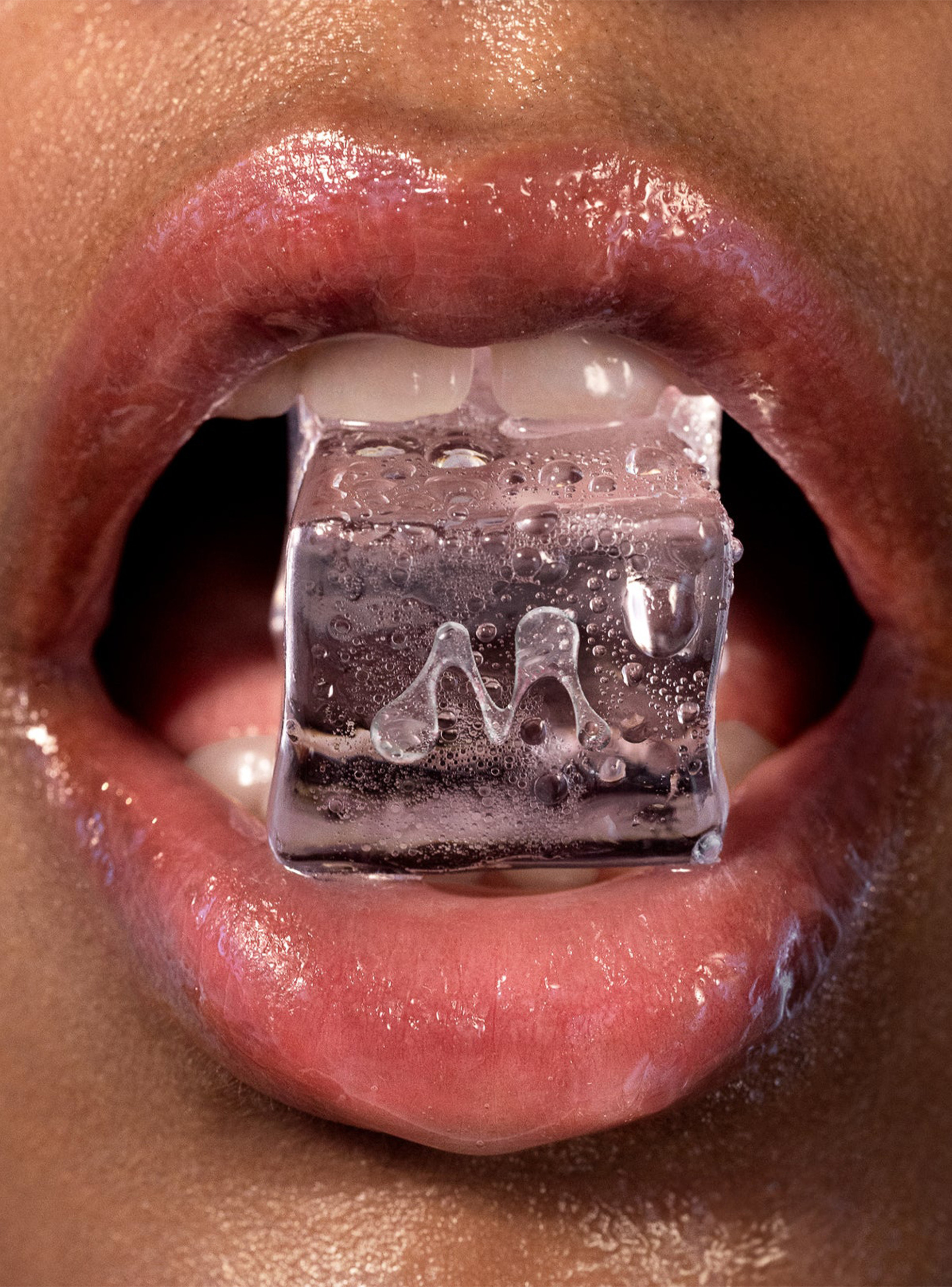
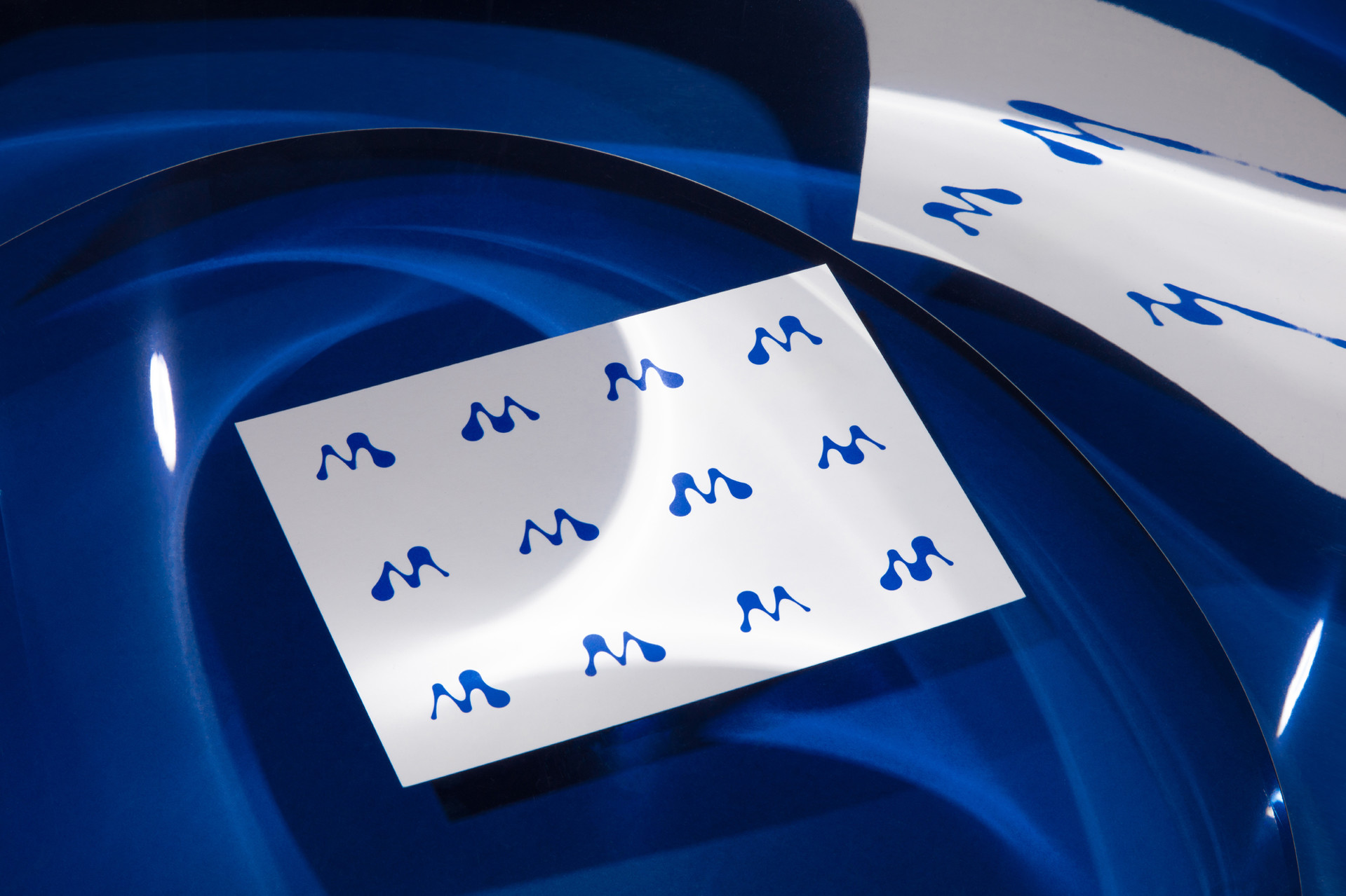
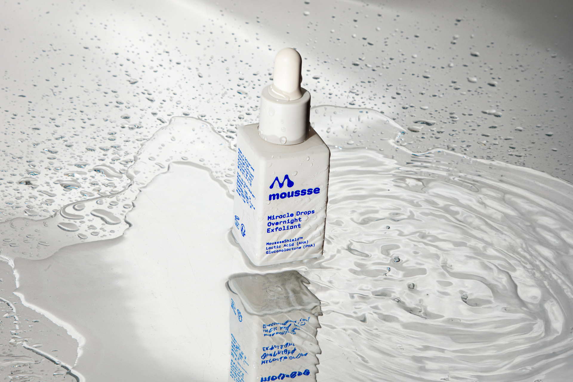
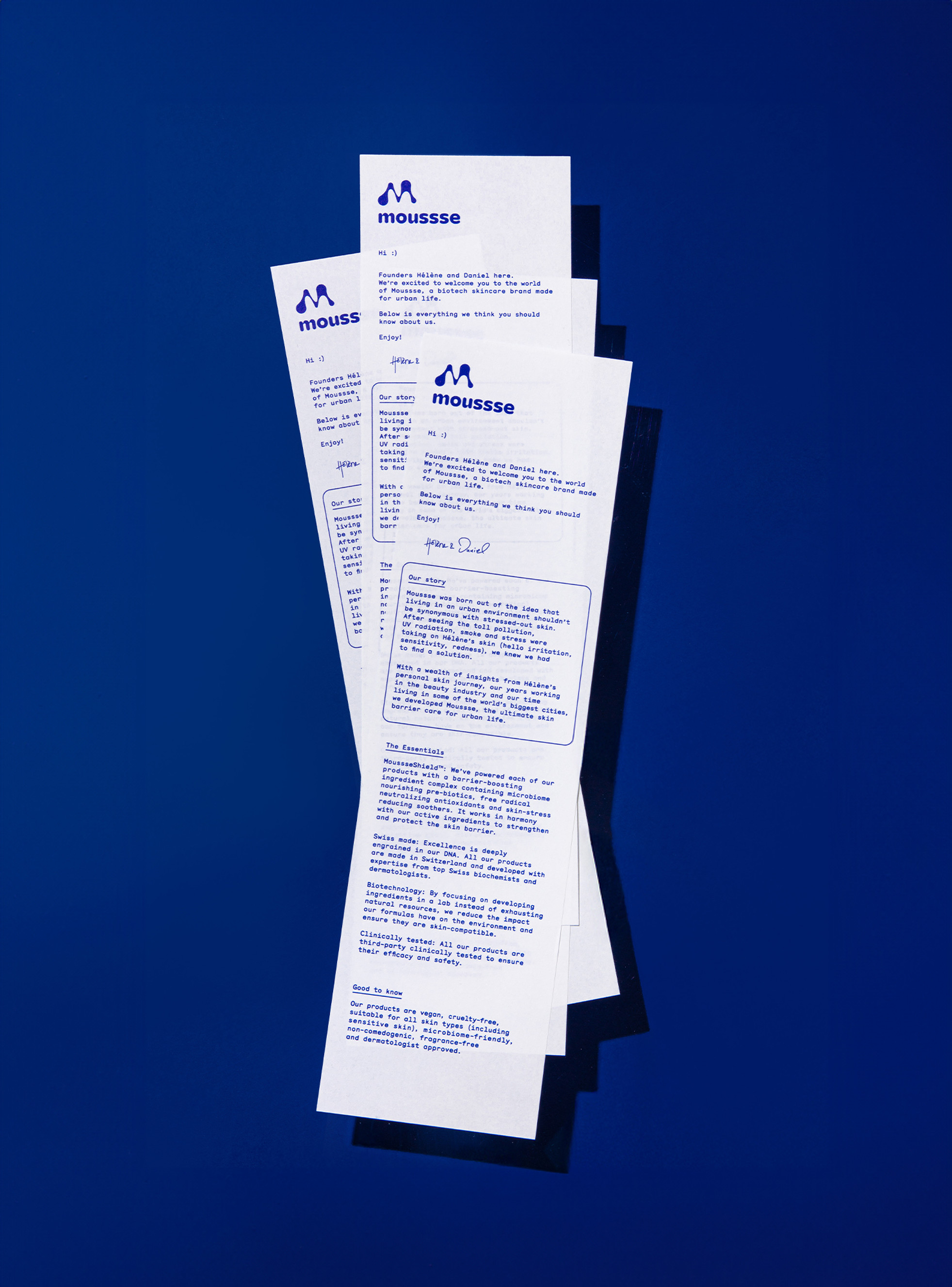
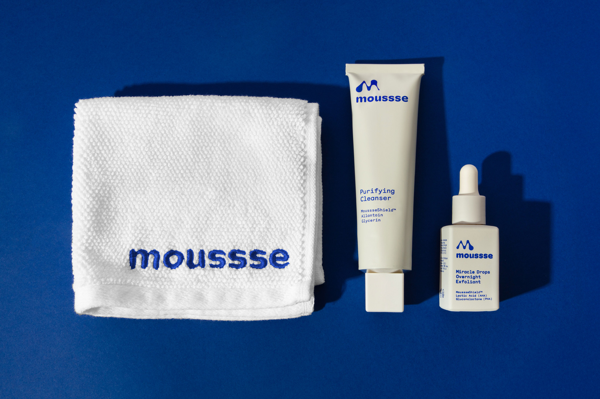
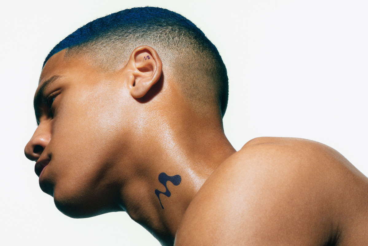
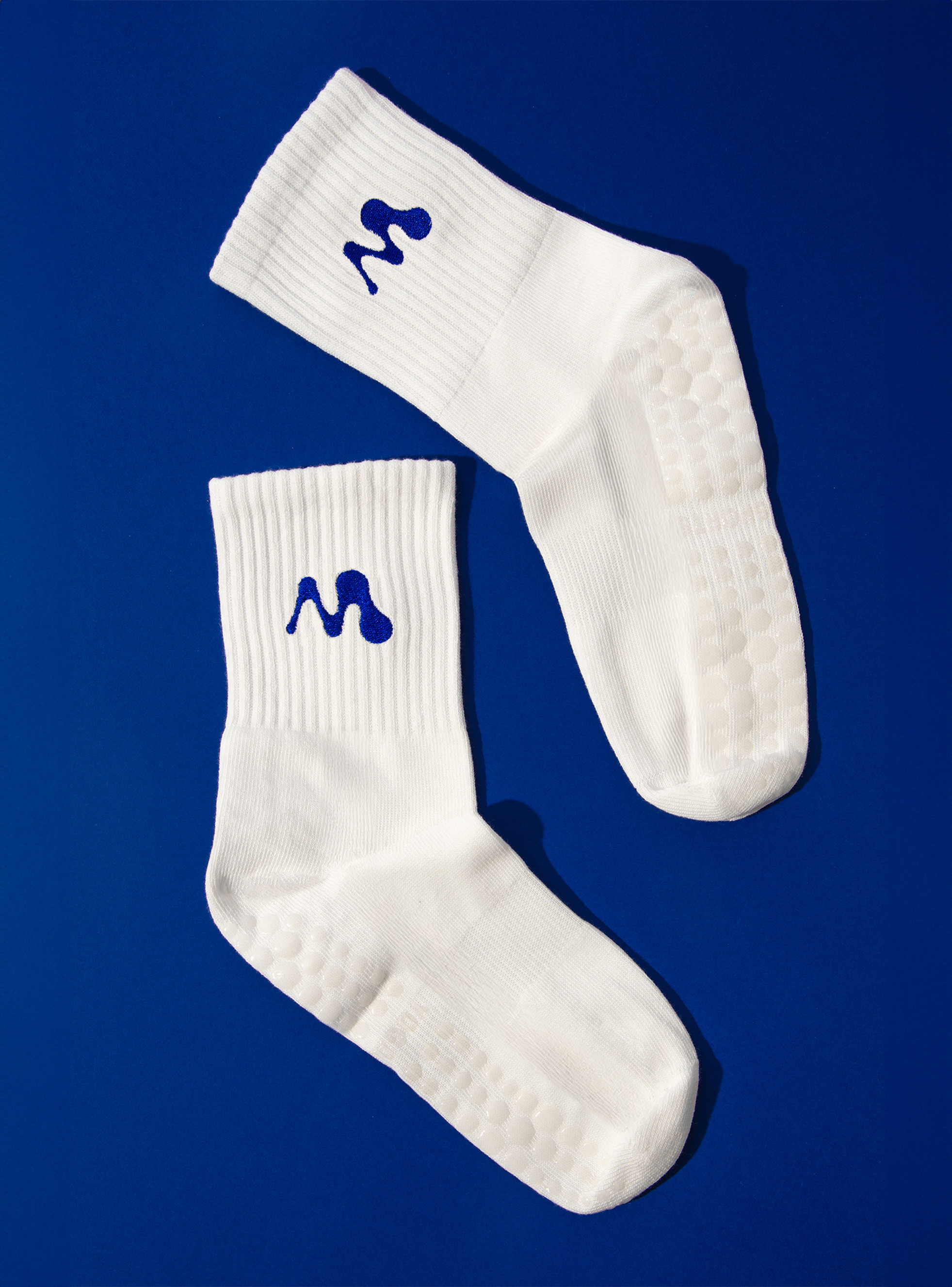
Beyond the core system, we created pictograms and delivered a minimal and evolving set of brand guidelines. We now accompany the founders as moussse experiences exponential growth.To deploy the brand for its commercial launch we also produced packshots, still life photography, and video content.
studio shots : Emmanuelle Lubaki for Yorgo&Co
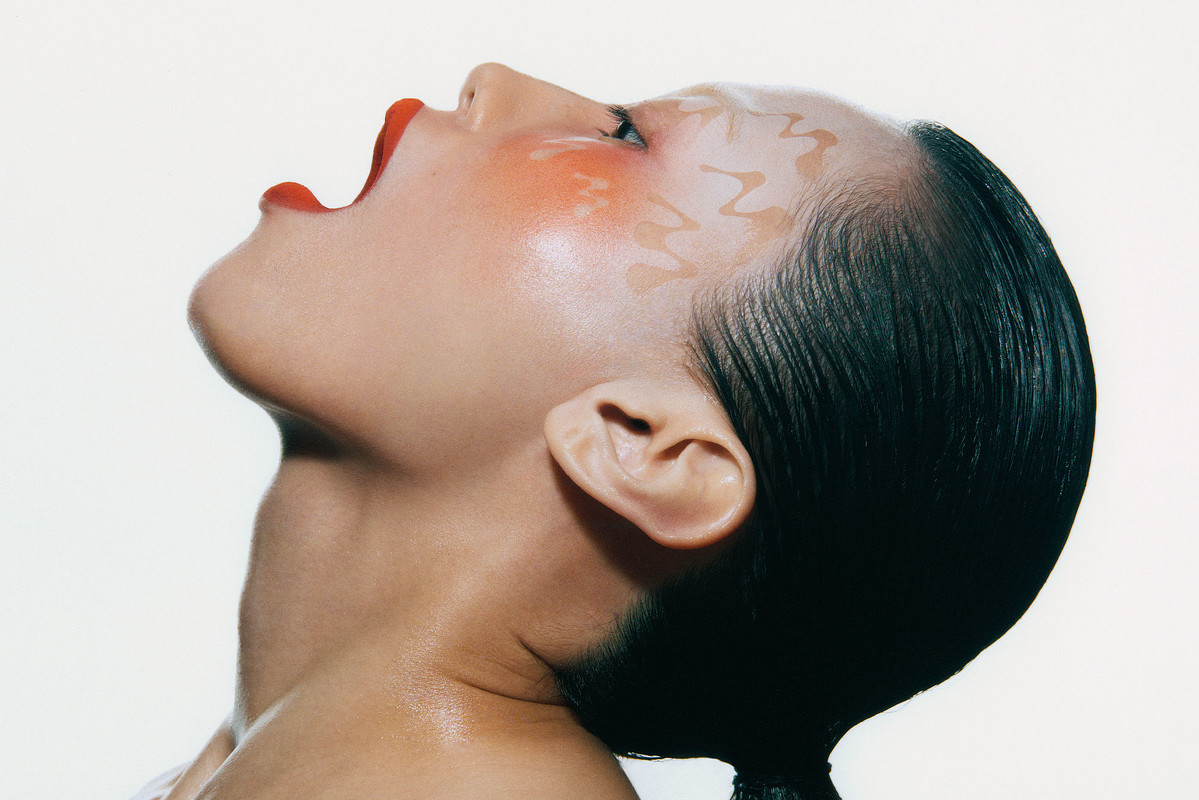
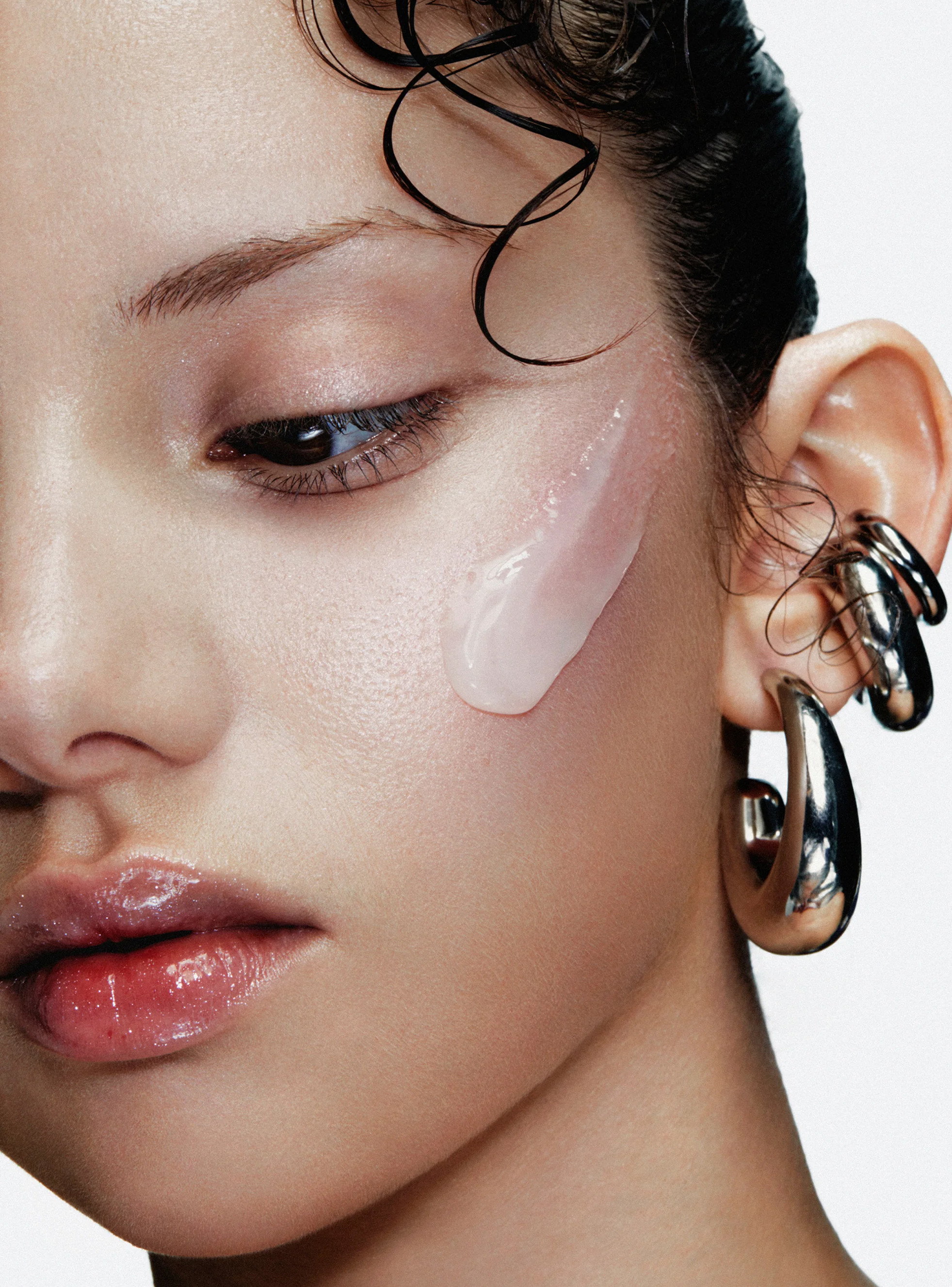
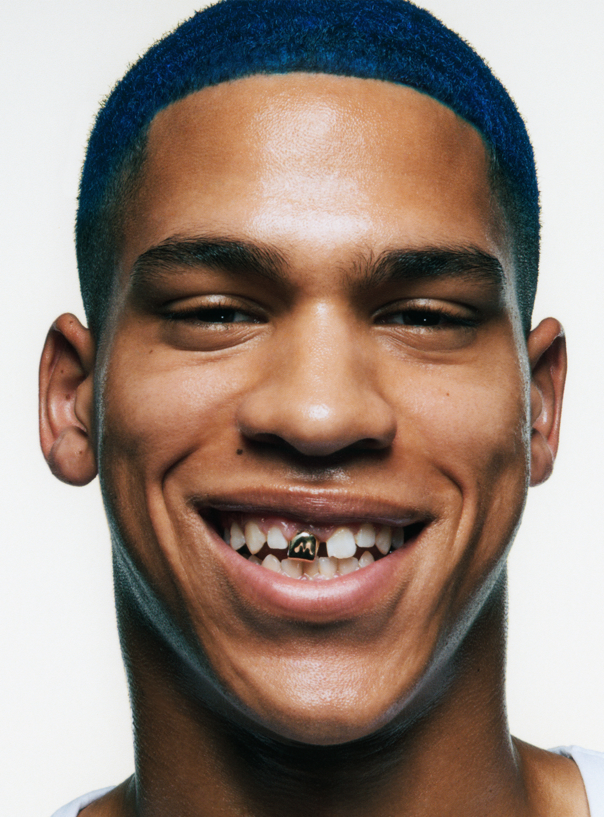
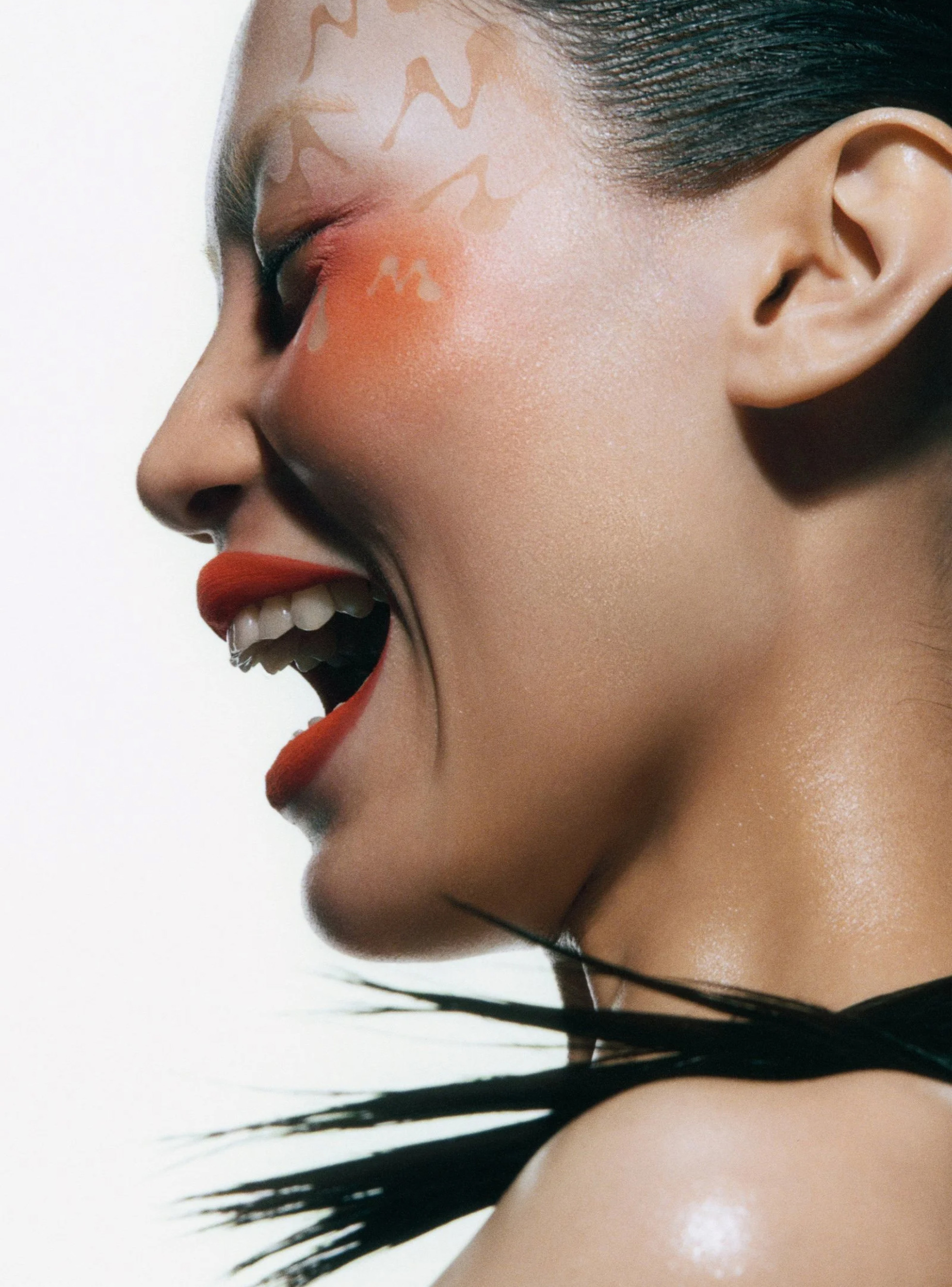
beauty shots : Andrew Vowles for Moussse